I have been working hard over the last year, and fitted in a house move, and another London Marathon run – phew!
I have a few new projects which I’ll be updating my website with – some new work with Linda Cruse, some brand updates and a new website for Dart Sails and Covers, more work with the School of Natural Skincare and some new blackboards. I have some new work for my Etsy store, coming soon when I have five minutes spare!
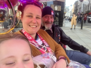
I’ll try and get the site more updated soon, but in the meantime, here’s a photo of me and the family in a tuktuk after the London Marathon 🙂
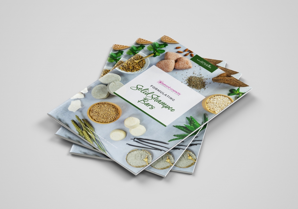
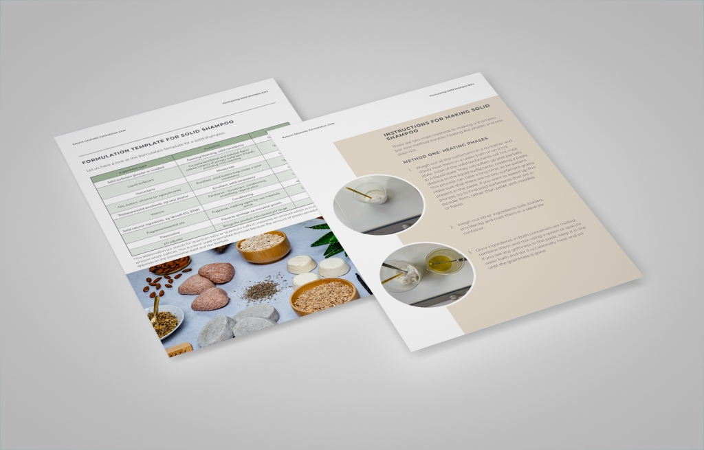
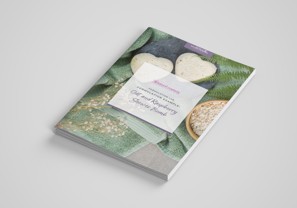
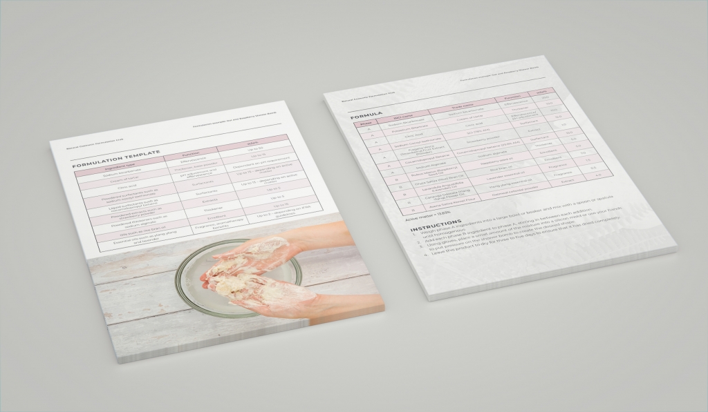
Over the past year I’ve been working with the School of Natural Skincare working on their course documents and other graphic design work. It’s lovely work, the images I have to work with are beautiful and the branding is great, so it’s been a dream job, balancing brand cohesion and creativity. I have uploaded a few images on my portfolio, a few more to follow soon. And have a look at their website, the courses look amazing, and very well put together – everything you need to make your own cosmetics, skincare and haircare products! www.schoolofnaturalskincare.com
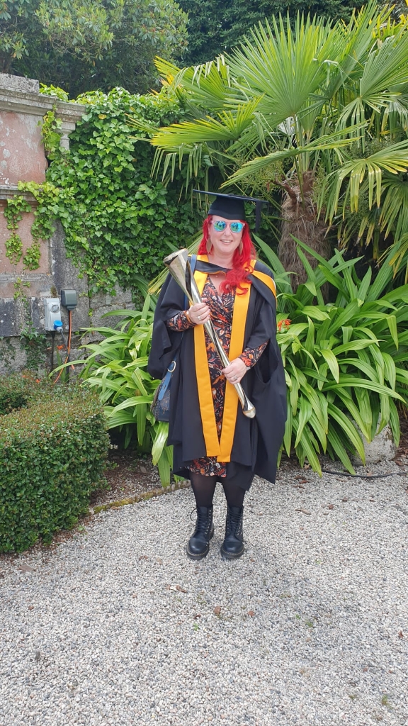
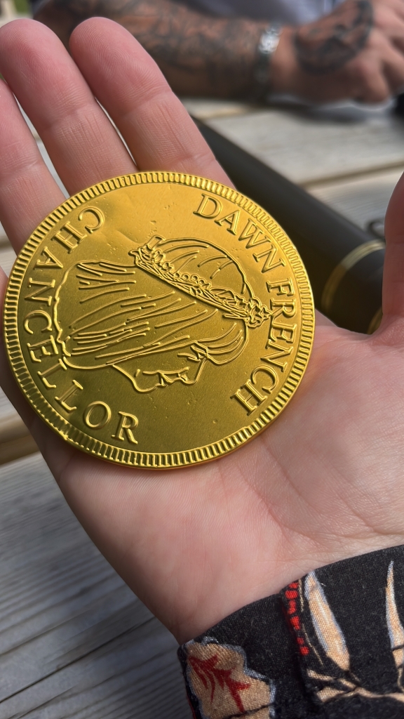
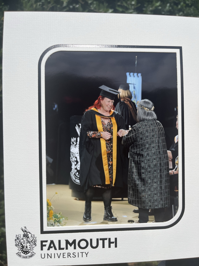
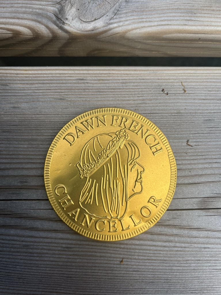
I graduated last week – at Falmouth University. IT was a great day, I was able to finally connect face to face with some of my cohort (it was an online course), wear the gown and cap and pose for photos, and I got to meet Dawn French who presented us all with a giant chocolate coin with her face on it!
It was a fab day, the sun shone, the wine flowed and it felt good to celebrate all that hard work!
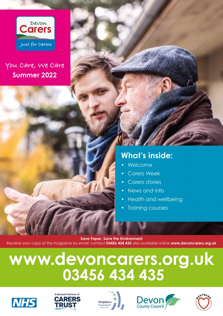
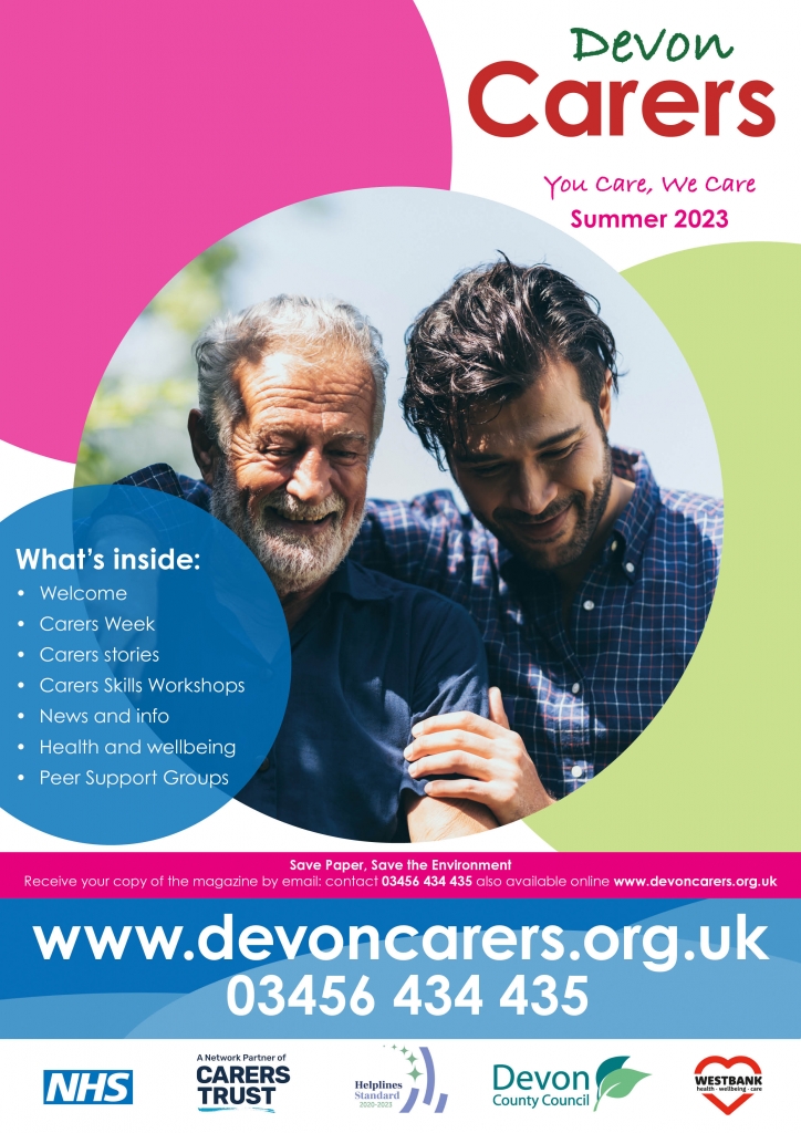
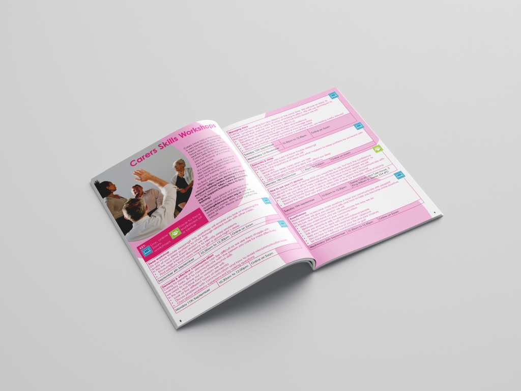
The Devon Carers team have been working on making their brand more cohesive throughout their website and literature. The website uses bold coloured circles throughout, and some of the supporting graphics have changed. With this in mind, we worked on updating the branding for the magazine.
Old front cover
New front cover
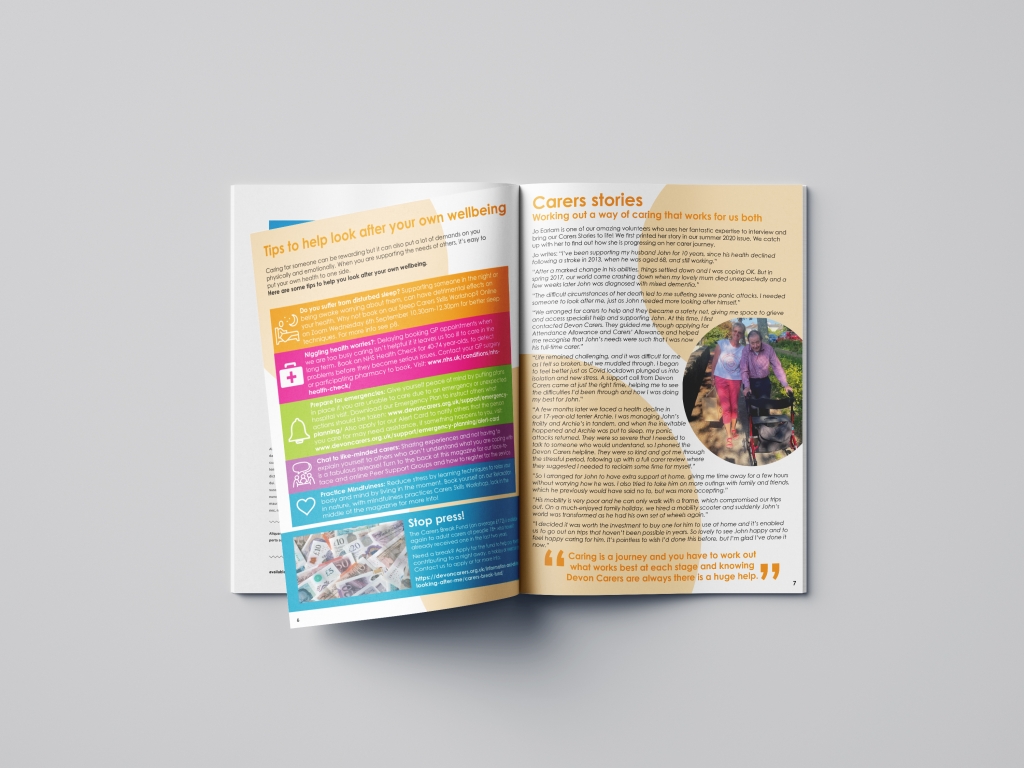
We then incorporated these changes in the main body of the magazine, using the circles as a background, and making the images circular to match. We lost the large section titles, but kept the colour coding throughout.
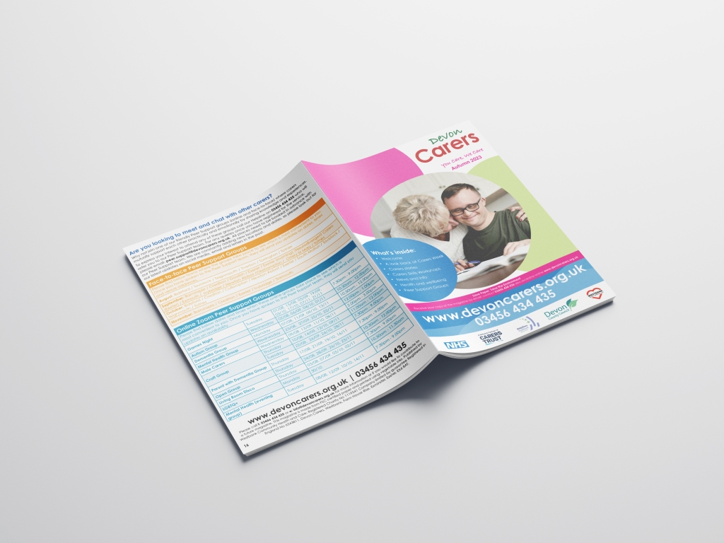
Finally, the face to face groups have evolved into a mixture of both online and face to face now, and we have reflected this on our back page. With such a lot of information about the groups, we have tried to edit it down to the most important details.
I was asked to update the old Westbank branding and logo. They wanted a modern take on the existing design, keeping the old elements – the heart, the colours, and changing the tagline. They wanted two versions, a normal version, similar to the old one, and an adapted smaller landscape design for use on certain publications.
I wanted to make sure the heart wasn’t too cutesy or romantic, that it encompassed the community and care elements of the organisation. I went for a more rounded sans serif typeface to create a slightly friendlier look, and kept the ratio size for the normal version.
old logonew logo
I then adapted this design into a smaller landscape version, using the whole heart, and a lowercase version of the name, but keeping the tagline the same.
It’s being rolled out across their services and publications over the next few months.
As part of my final project, I had to write a critical report based on my project question, and the research I undertook.
My question started as:
How can we turn anger and despair within feminism into effective change? Can we help women use design as a methodology to work through their positionality on particular views?
I researched protest graphics, feminism over the last 100 years and how the visual arts helped to create change. Throughout my research, by question evolved and became:
How can graphic design empower women to effect change? Can we use activism and graphic design
to help women portray themselves as an empowered community rather than as victims?
This was in conjunction with the other part of my project, detailed in my last blog post, and my research changed and evolved into something more about empowerment, and using graphic design as a way of making change, within communities and society as a whole.
I’ve finally finished my MA! I wanted to share with you all my final project:
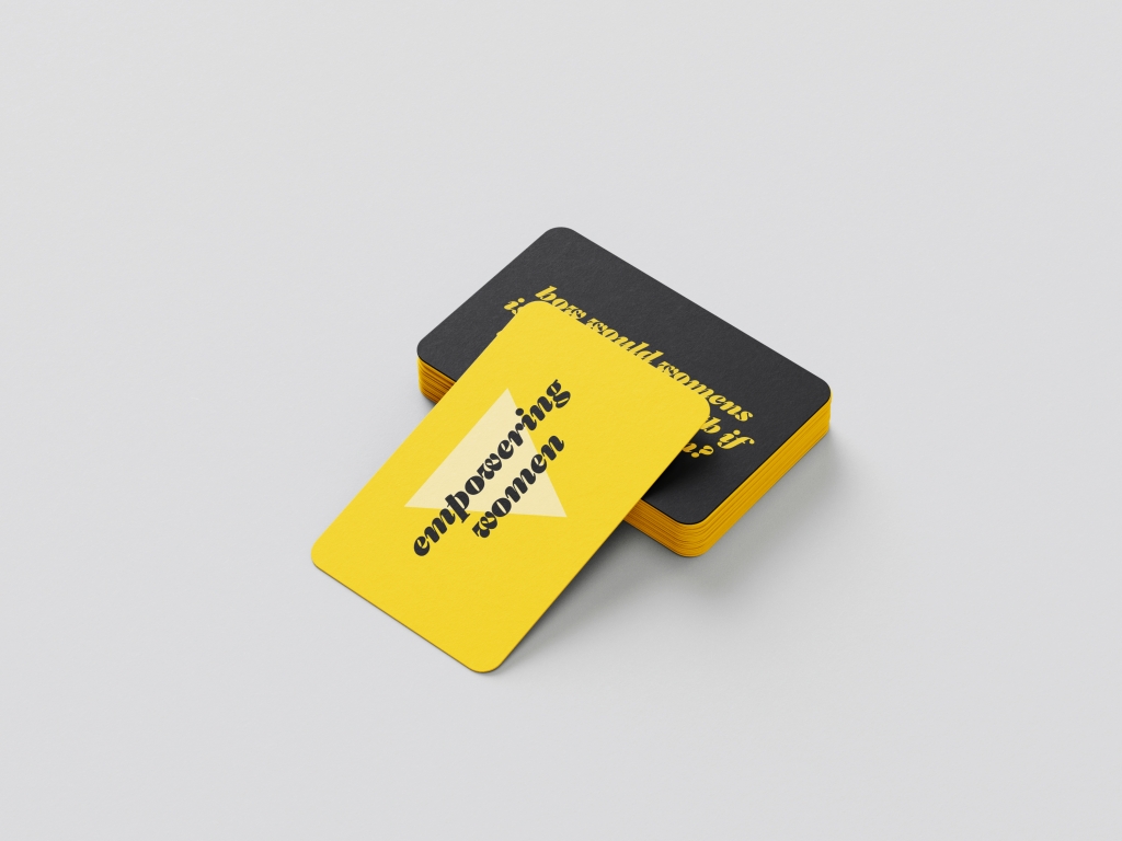
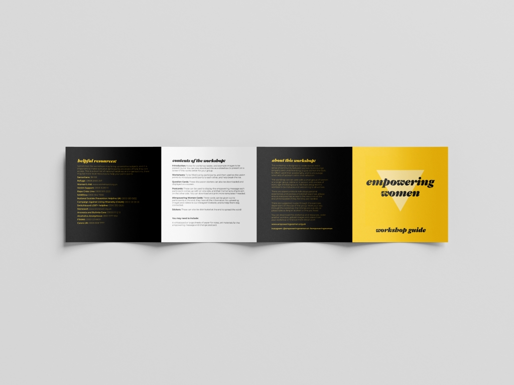
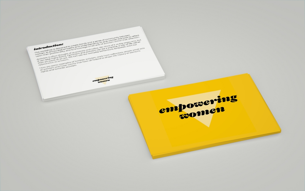
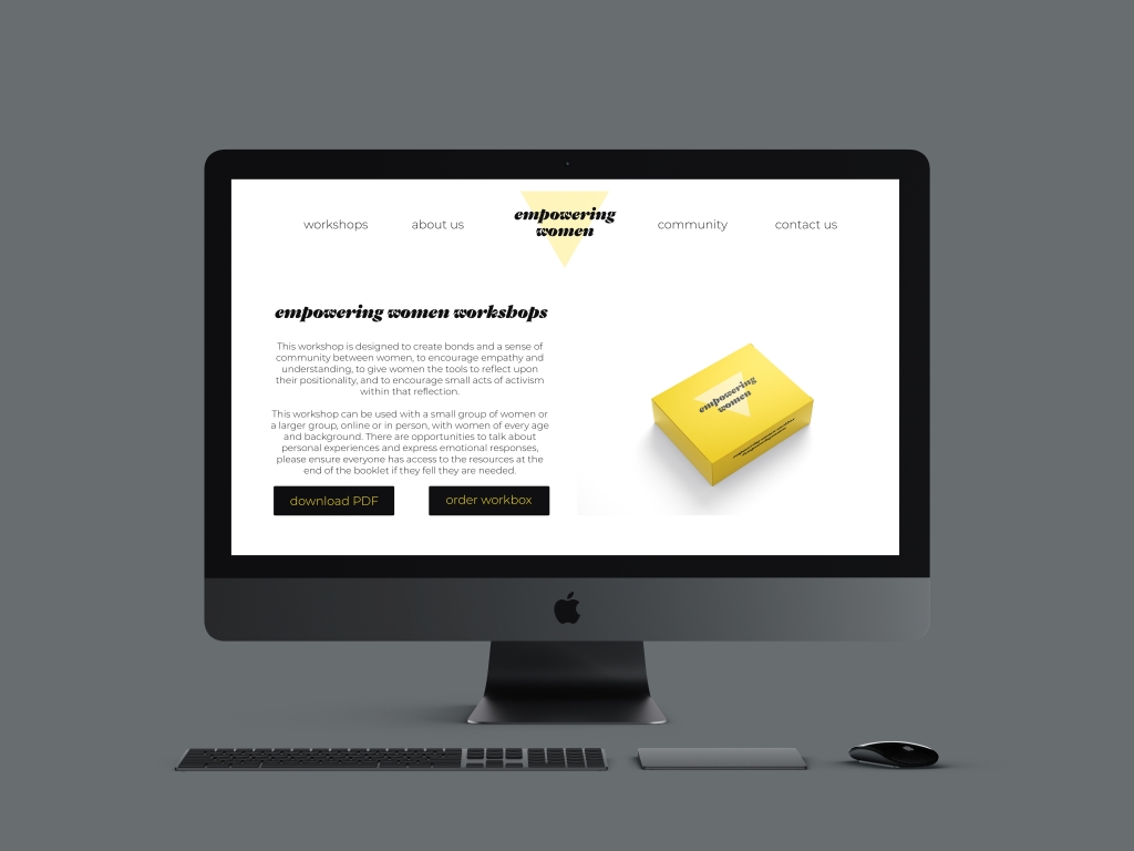
Empowering Women Workshops:
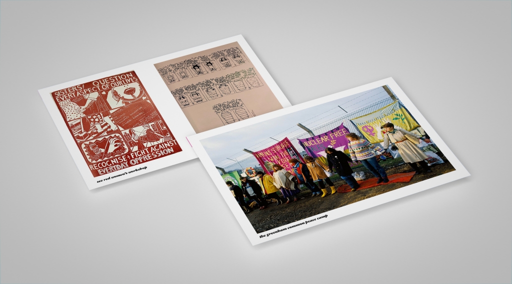
I wanted to use this project as an opportunity for a research based project, with the possibility of further study at PhD or development of the project as a self-initiated project. My studies over the last few years have made me realise that we have the power to inform, inspire and create change. That we have a responsibility as designers to ensure we consider the social and ethical points of view within our work. It is important to know and understand your history to be able to work for and understand abetter future – knowing the history of graphic design, how we got to where we are, and who got us here, is therefore a great framework for my practice.
During this course, I have been the most engaged when looking at graphic design and society, design for good, design for politics or for social change. I find it fascinating, how design informs historical, political and social events and changes and how these also inform design movements, trends and new technology. I am interested in design as a force for change, used to inform and educate people, and how powerful it can be. In particular, I am passionate about feminism, women’s rights, equal rights in general and gender politics.
I started to plan an inital workshop, to enable women to come togther, discuss feminist issues, see some examples of feminist activist graphic design, and to come up with their won designs, based on what they felt passionately about.
I looked at creative exercises that could be used and adapted to help the participants to think creatively about the subject. I researched building my own creative workshops, and tools to help me with this, and find some interesting resources in the DIY toolkit and on the Government’s Open Policy Toolkit, amongst other places.
I spent time planning and designing the workshops, trying to ensure they are creative, and informative, giving people enough time and scope to create some activist artwork.
After some research and some tutorials, I realised that my research question had evolved, and I re-wrote it. I still wanted to do the workshops with some women, to talk to them about issues and empowerment, and collect some empowering messages. So I planned to continue with this idea, and set up a few workshops.
How can graphic design empower women to affect change? Can we use activism and graphic design to help women portray themselves as an empowered community rather than victims?
I spent some time working on the structure of the workshop, something that would work for both an online workshop, and a face to face.
I ran two workshops, one online and one face to face, changing the format slightly for the second one, and just using the change card questions as a basis.
We covered many different subjects, discussing everything from body autonomy, healthcare, safety, image and finances. The women were a little hesitant at first, but I found that the questions based on the Change Cards were really successful in getting them talking. In fact, I found any prompts I used were great for getting the conversation going, and once they started talking there was no stopping them!
Not only did they come up with some empowering messages, but they also sparked discussions about issues that didn’t necessariy affect all of them, but got all of them thinking about our behaviours, attitudes and views on certain subjects.
The feedback from the previous workshops was that whilst it was really good to talk to other women, a lot of them went away and thought about what we discussed.They thought about things that they didn’t realise might not be helpful and little changes that they had made since.
I had researched different kinds of activism, in particular the Moyer’s work on the four roles of social activism, and I want this project to be about small acts of reflection and small acts of activism.
I’m interested in community and how this workshop brings women together to create bonds. This makes them feel stronger by showing them they are concerned about the same issues or they discover empathy and understanding for women in different situations, and therefore inclusivity and in intersectionality come into play.
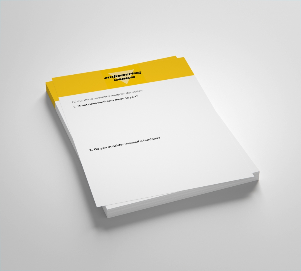
The worksheets help women establish their initial positions on the subject and work as an icebreaker to get the women talking. It also helps women discuss the different issues they have. Once this is done, hopefully there is a sense of community within the women themselves, and they feel comfortable talking to each other as well as more understanding of the issues. The question cards help them think differently about women’s rights and the issues, and help get them thinking creatively. They are asked to come up with an empowering message either for themselves or for other women that they write on the postcard. Then as a final piece of reflection, they think about what they’ve learnt and any small actions they can take to make things better i.e. a change of language, behaviours or a change of attitude. They write three things they will try and incorporate into the feminist practice at home, at work, or in social situations.
Empowering Women Worksheet:
1. What does feminism mean to you?
2. Do you consider yourself a feminist?
3. Can you think of some feminist/women’s rights issues that affect you personally?
4. Do you have any experiences where being a woman has been a disadvantage?
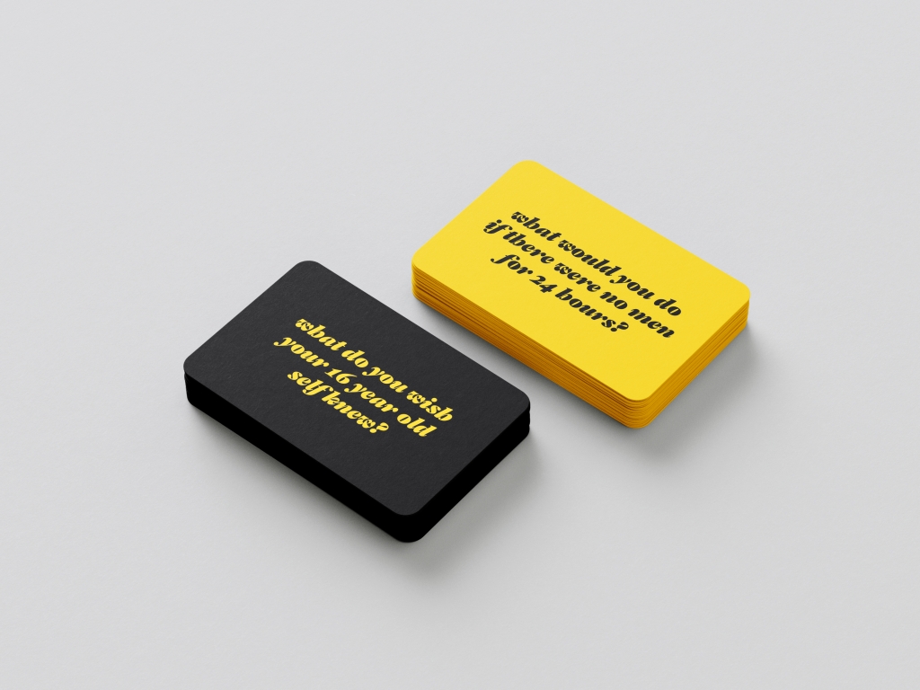
Question Cards:
What does feminism look like in 2040?
How would your career be different if you were a man?
What would you do if there were no men for 24 hours?
What do you wish your 16 year old self knew?
What would be different if women ruled the world?
How would issues such as healthcare, education and childcare be dealt with if they affected men?
How would you change things if you were a man?
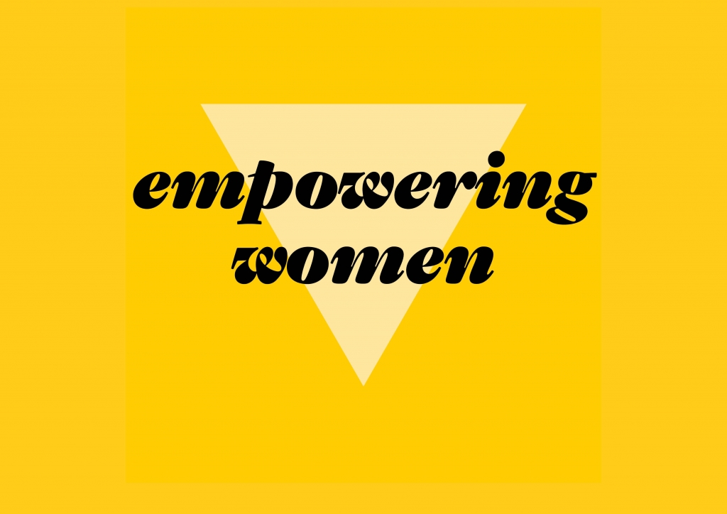
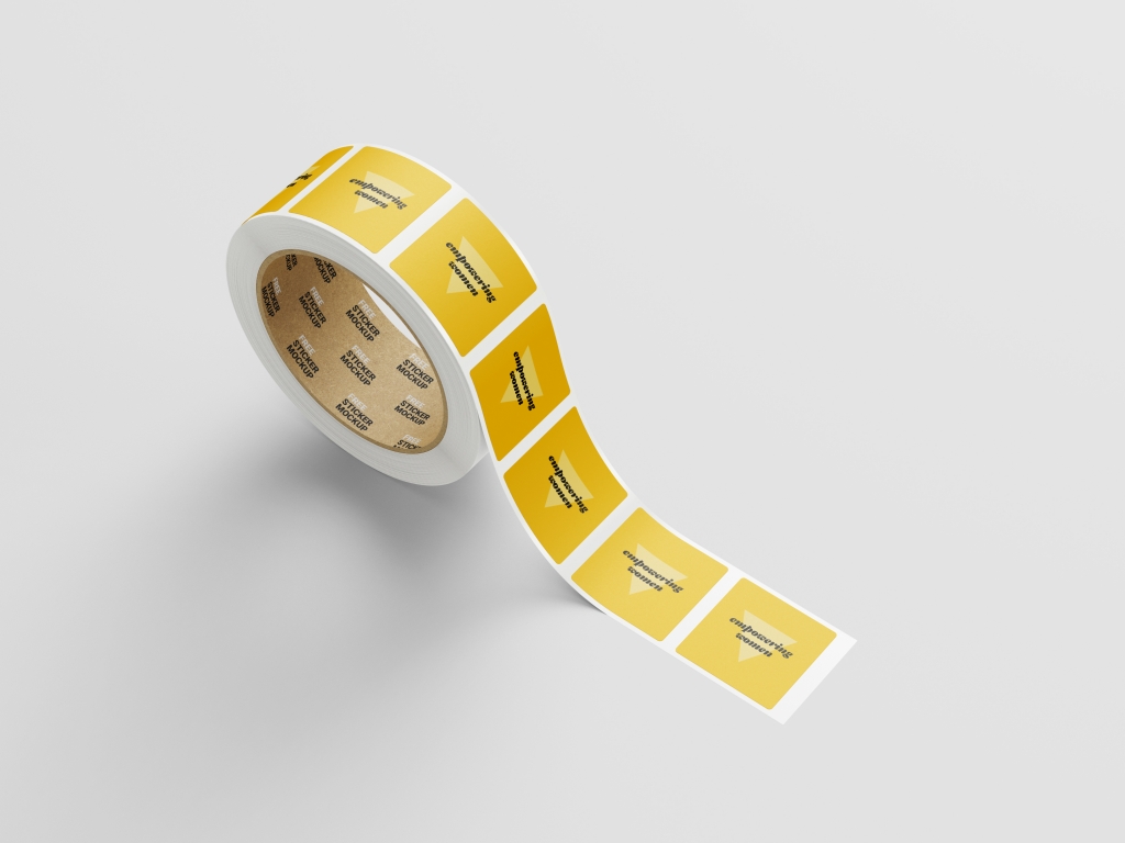
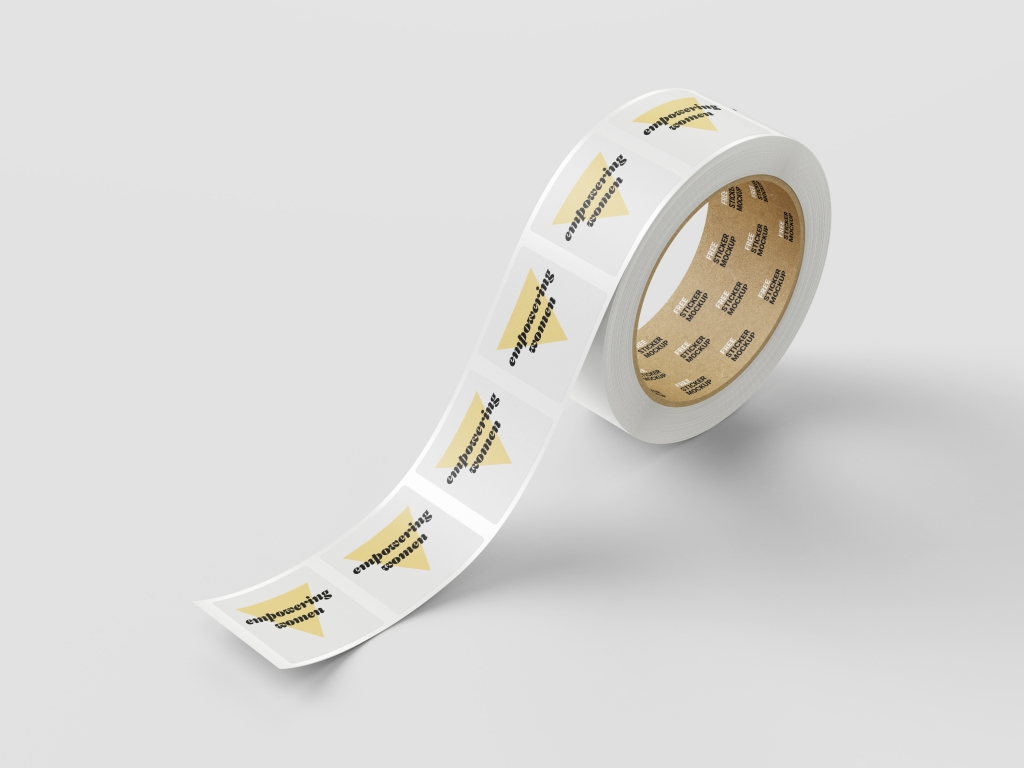
I went down the route of using yellow, black and white, yellow for hope, optimism and positivity. I used big bold typefaces, that were bold and feminine, and use the simple triangle as part of the identity, symbolising womanhood.
This workshop is designed to create bonds and a sense of community between women, to encourage empathy and understanding, to give women the tools to reflect upon their positionality, and to encourage small acts of activism within that reflection.
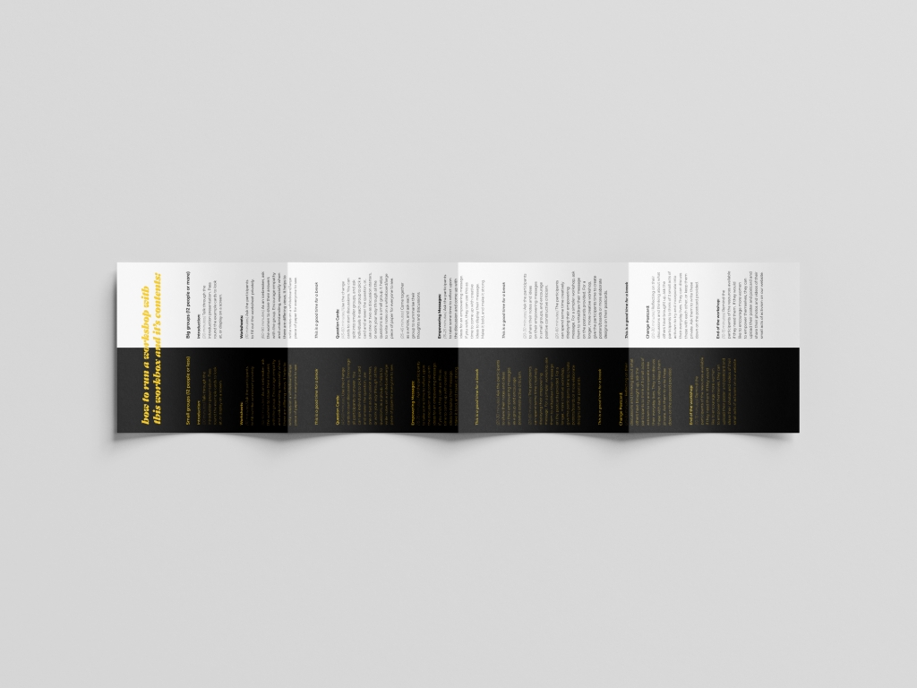
This workshop can be used with a small group of women or a larger group, online or in person, with women of every age and background.There are timings and a structure to follow, but the workshop can be adapted to a more creative output, or for a longer day session.
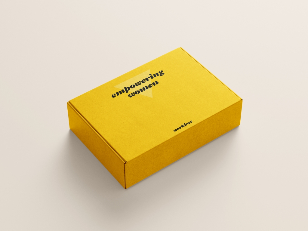
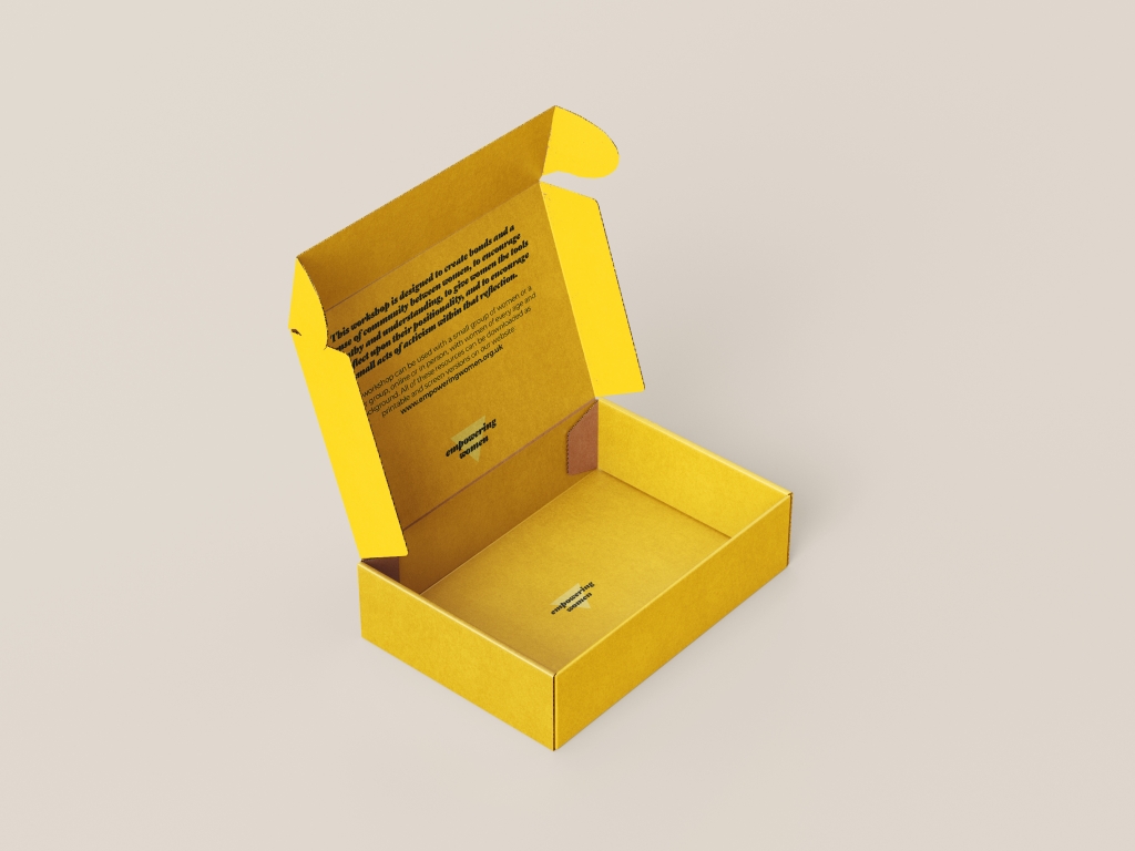
The workshop materials come packaged in a workbox, and also as a downloadable PDF.
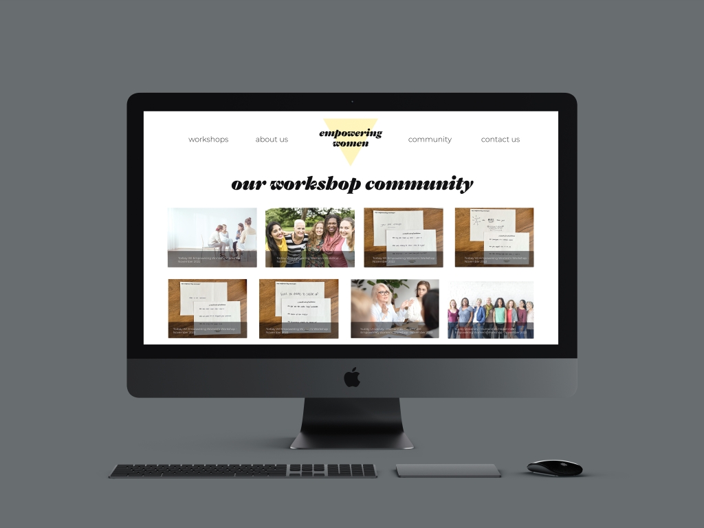
I have mocked up a website where you can get the workbox or download, but also where participants can upload images and engage in the community aspect of the project. The afterlife of the workshop means that the bonds of community can be maintained, and the reflection can continue and be recorded if the participants wish.
The next step with this workshop would be to test the prototype with more groups of women. I would like to have tested it with a wider range of diversity, more LGBTQ+ groups, and different women from different locations.
The feedback I had from the original workshops was amazing. I thought that it would be a good project for women to air their anger and grievances in a constrcutive and creative way, but it turned into a more reflective exercise and I am still getting feedback telling me how much the participants had thought about what had been said. There was an overwhelming feeling of empathy and understanding for issues that some of them had not experienced or considered. The positive feelings of hope, community and reflection were amazing and I hope that I have managed to distil this into my project.
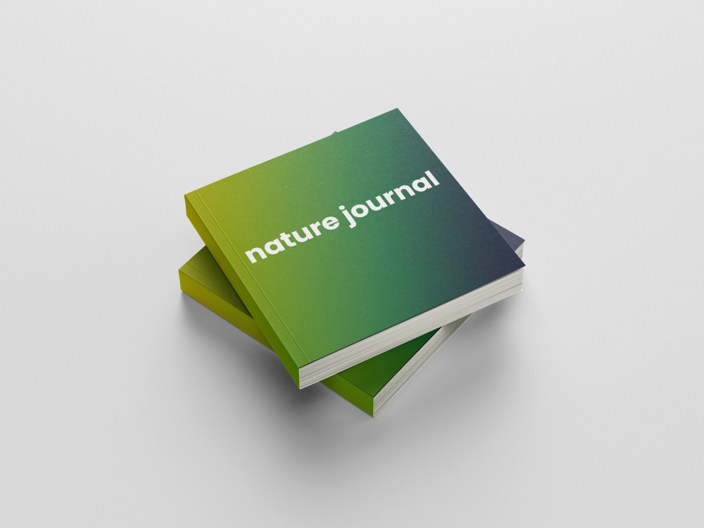
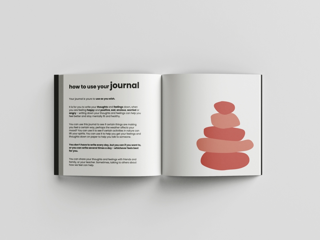
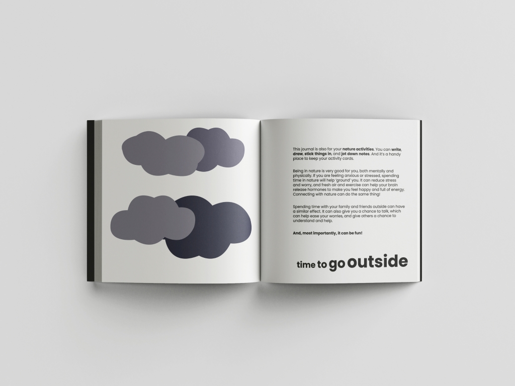
I entered my Nature Journal project from University in the Creative Conscience awards back in April/May. I received an email in August to tell me I had won an award! We have to wait until 20th September for the online Awards Ceremony to find out what I have won, but I am excited!
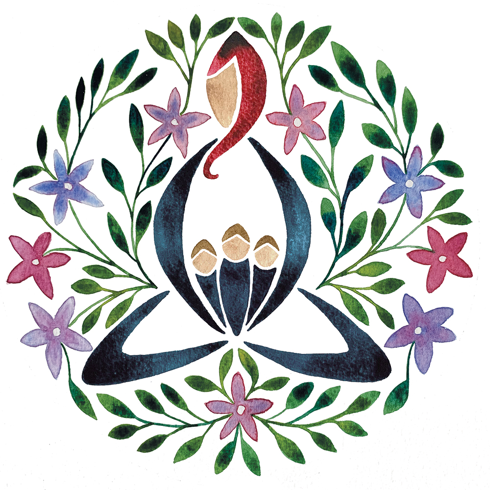
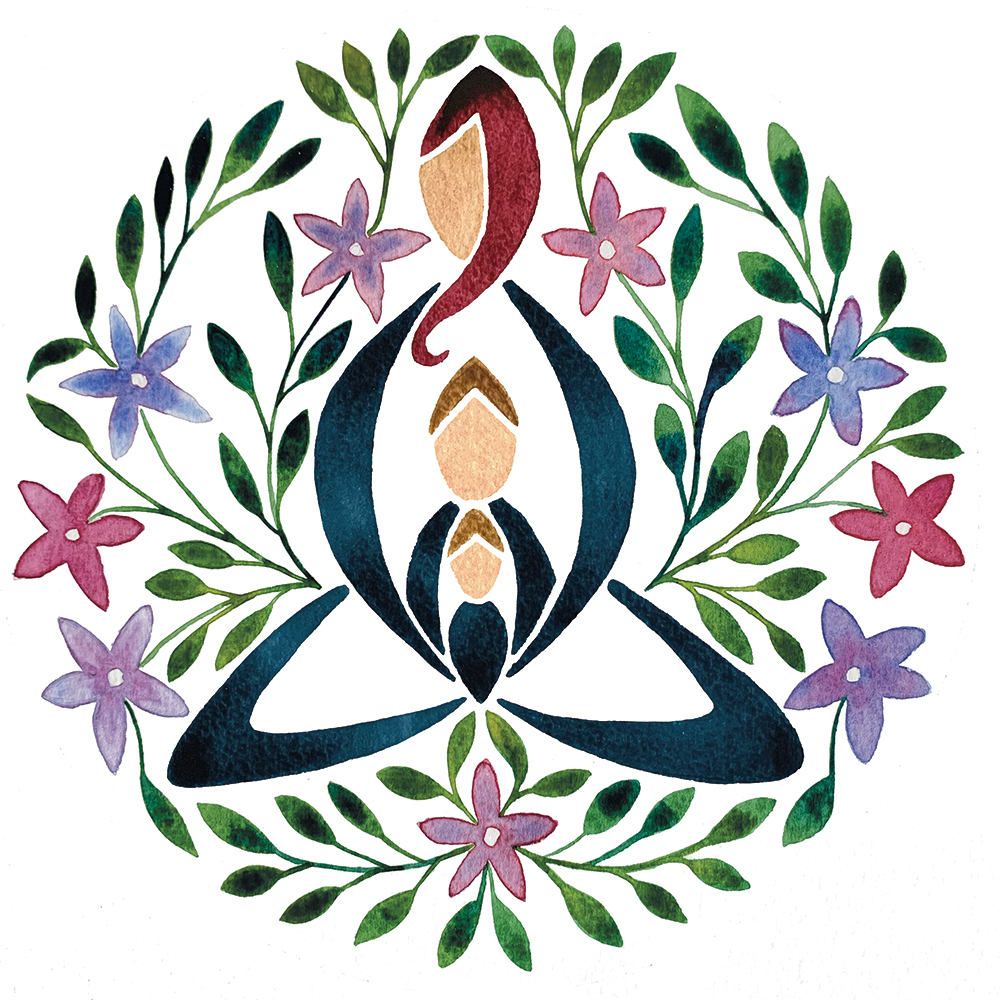
I’ve been working on some new versions of my Mother and Child print, and have produced a range with multiple children. They are not in my store yet… it may be a few weeks or so, but the artwork is done! I have had many requests for these, and it’s been good to finally find some time to be able to do these!
I am on the last module of my Master’s now, my Final Major Project, which is due in December. I thought I’d share my last module with you again… some of the work I produced and what I have learnt.
This project involved writing and producing a designed essay. I wrote an essay entitled ‘A Love Letter to the Sea’ and rather than designing a print piece, I decided to produce a small film. Again, this was a small project, with only 4 weeks, so I managed to produce a few scenes from the essay, using the type as an animated layer above the film. I have been interested in subtitles and how effectively they are used within films and TV programmes, so this was a fun experiment for me, using new media, software and skills.
I enjoyed this work, and plan on working on this film more, and producing the whole essay at some point!
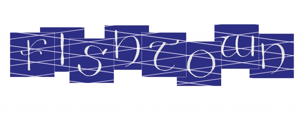
I also looked at typography and our local town as inspiration. I love typography, so it was fun to spend some time looking at environmental typography within my town and produce something based on history as well as contemporary. I used my calligraphy skills to produce and design this piece – Fishtown – based on my local town of Brixham:
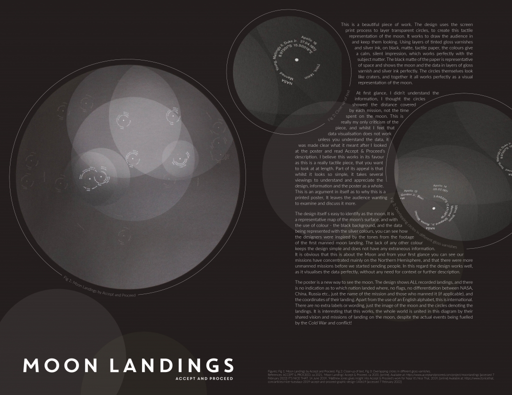
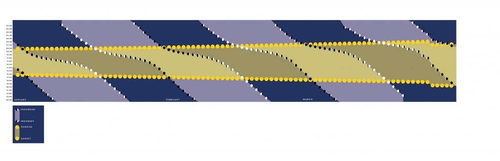
I also looked at data visualisation, at existing work, and critiquing it, as well as historical pieces and how it has been used to help people to understand data and spread information (and sometimes disinformation). I produced both a piece about an existing piece of data visualisation around the Moon Landings, and my own piece based on Moon rises and Moon sets, and Sunrises and Sunsets.
I’ll put these pieces in my portfolio. Final push now, just 6 months left, and it will hopefully be all finished!