100 Days of Lettering – Week 5

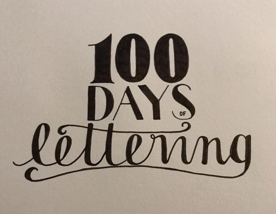
We have had a funny old week – I’ve got a lot going on at the moment personally, so this week was a little sporadic and I also missed a day… I needed to have a proper day off from work and everything.
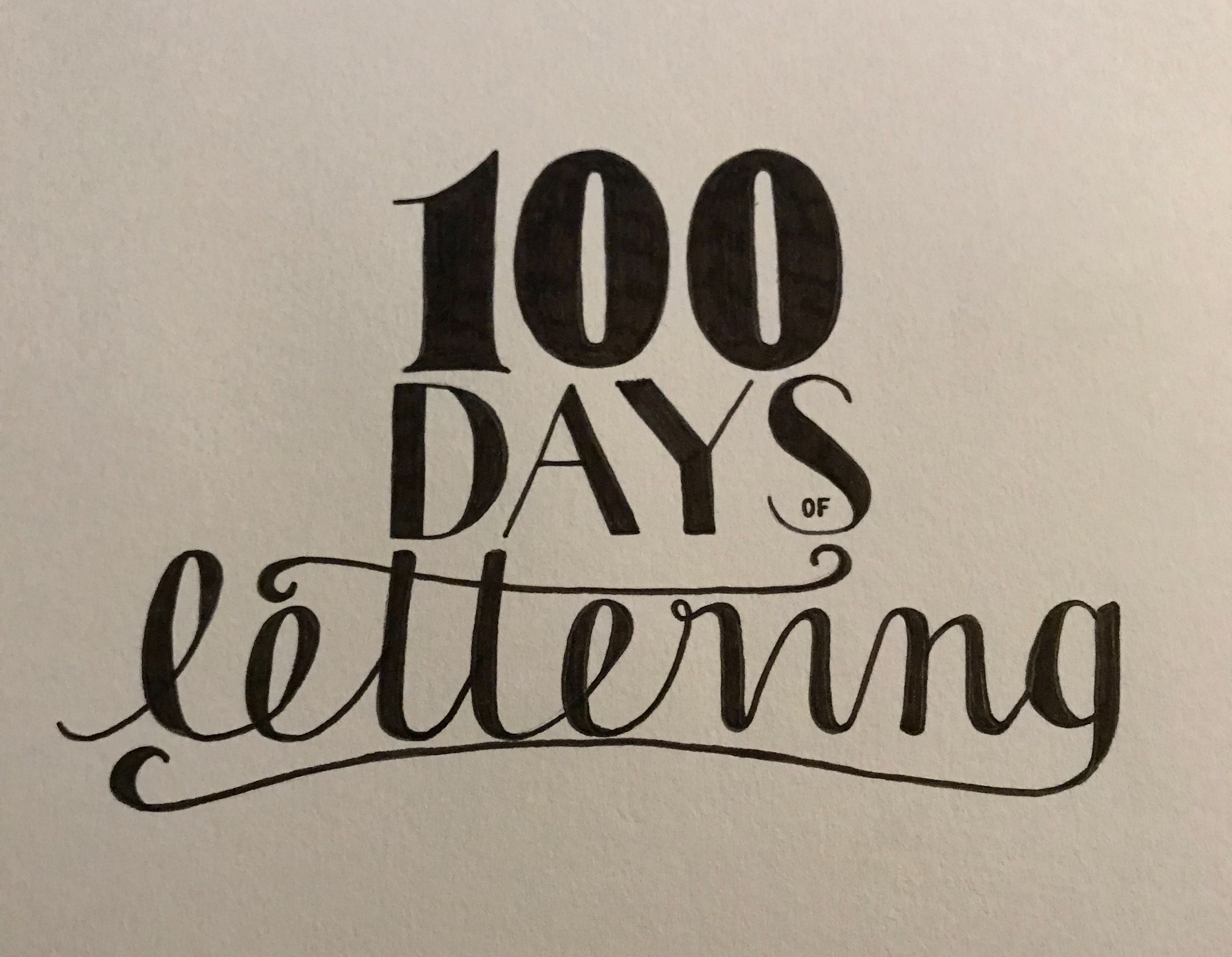
Day 29

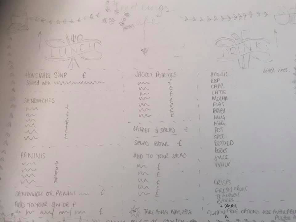
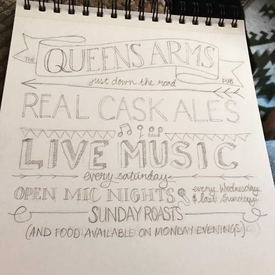
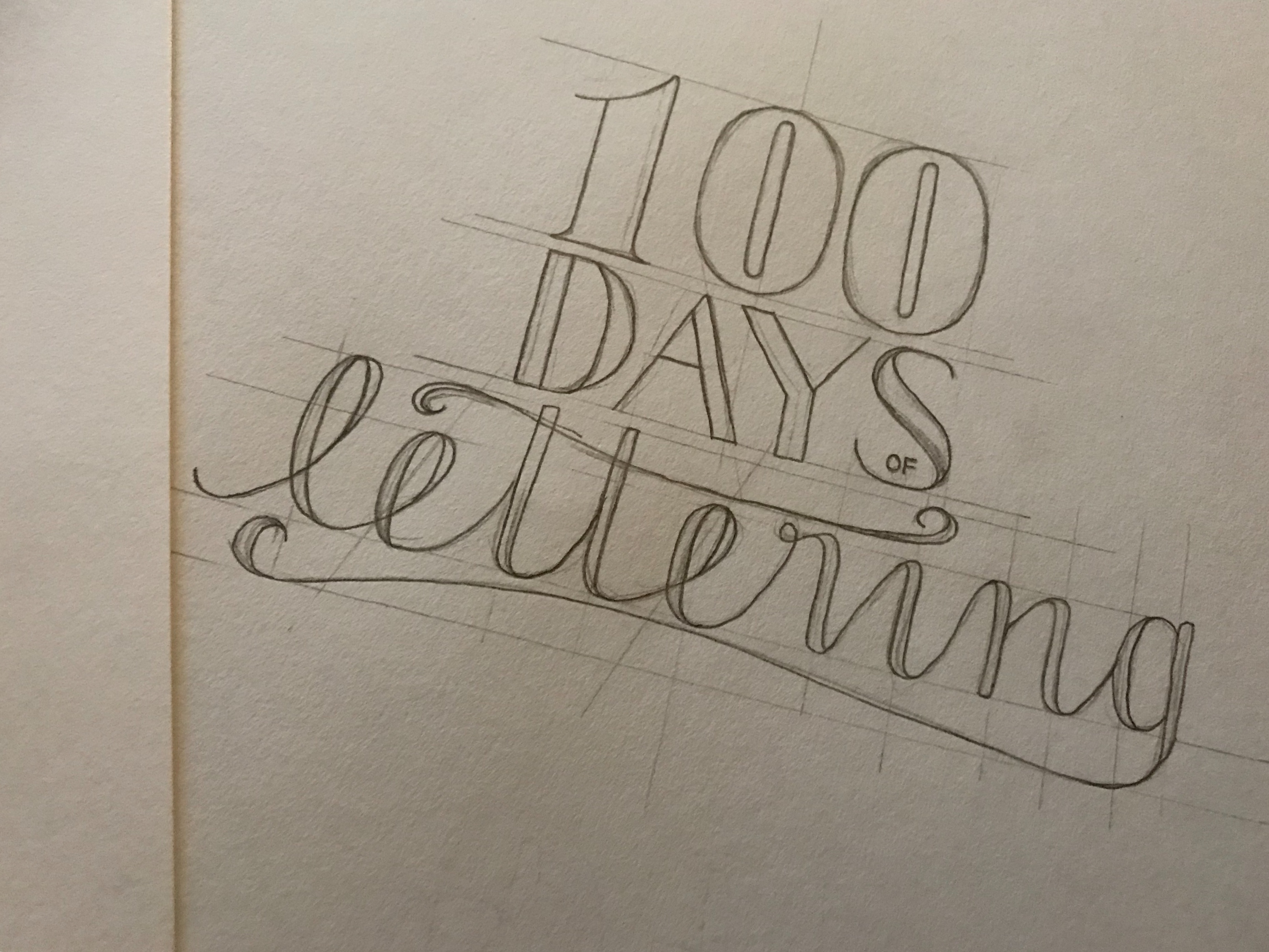
This was a sketch for a blackboard I am working on for a cafe. Not very pretty or neat but I thought it might be good to include something really rough that I then work from. Pencil on paper.

Day 30

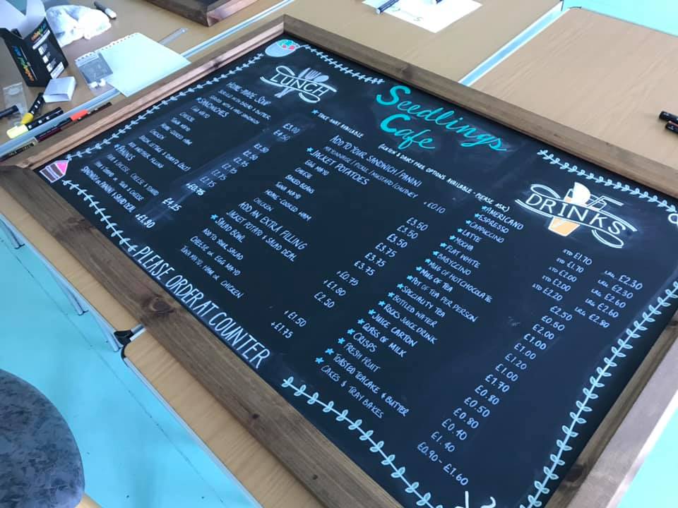
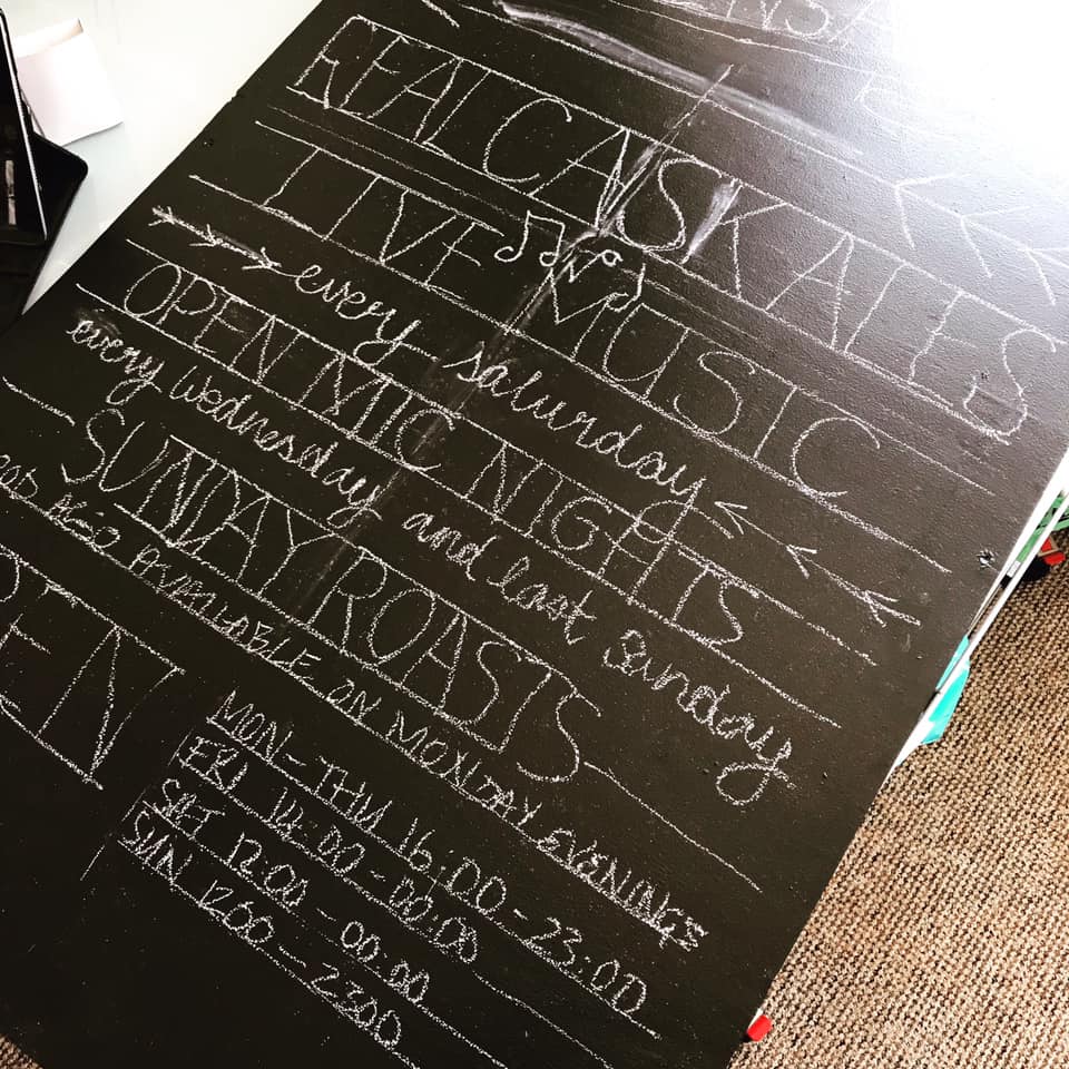
This was the final blackboard – the lighting was a bit weird so the colours don’t show up as well, and this was before it was cleaned up. I was pleased with this, there was a lot of information to get onto one board! Chalk pens on blackboard.
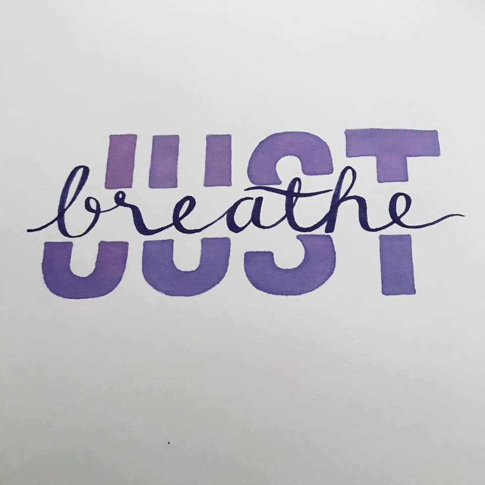
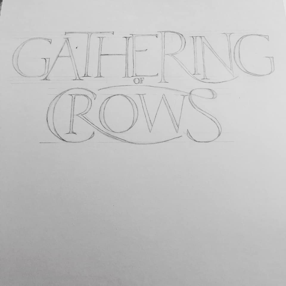
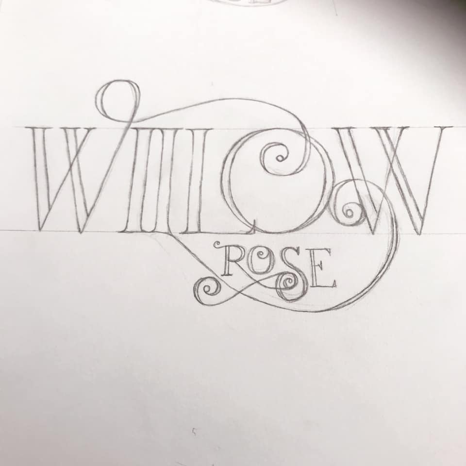
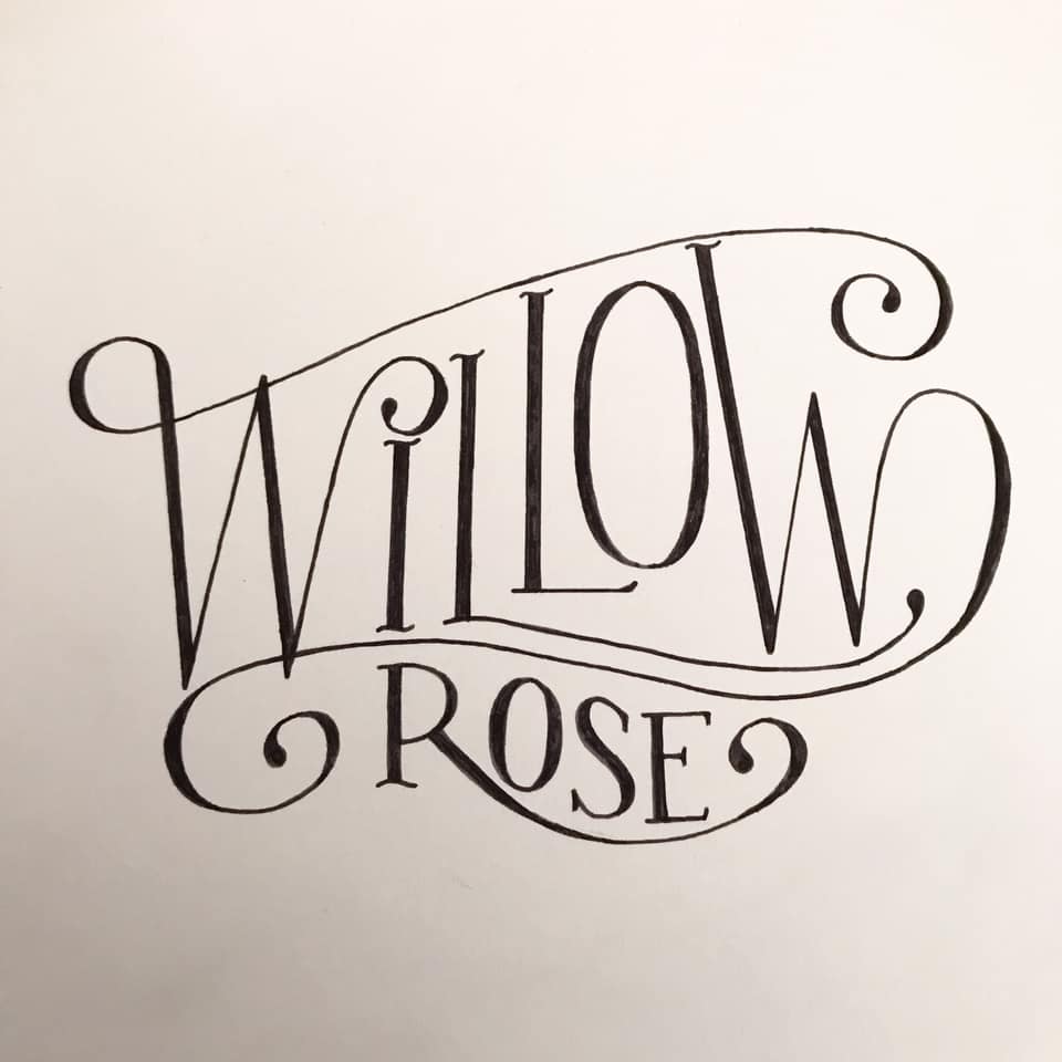
Day 31

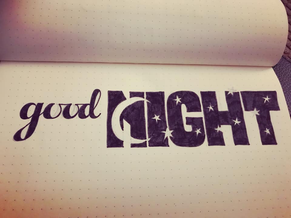
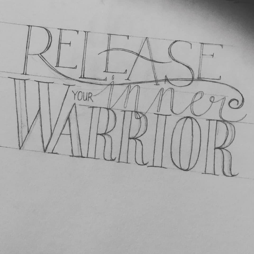
As I said above, I have had not had a lot of time this week, but I had an idea, and whilst this isn’t very representative of the final idea I have, it was a way of getting some ideas down on paper! Fineliner on grid paper.
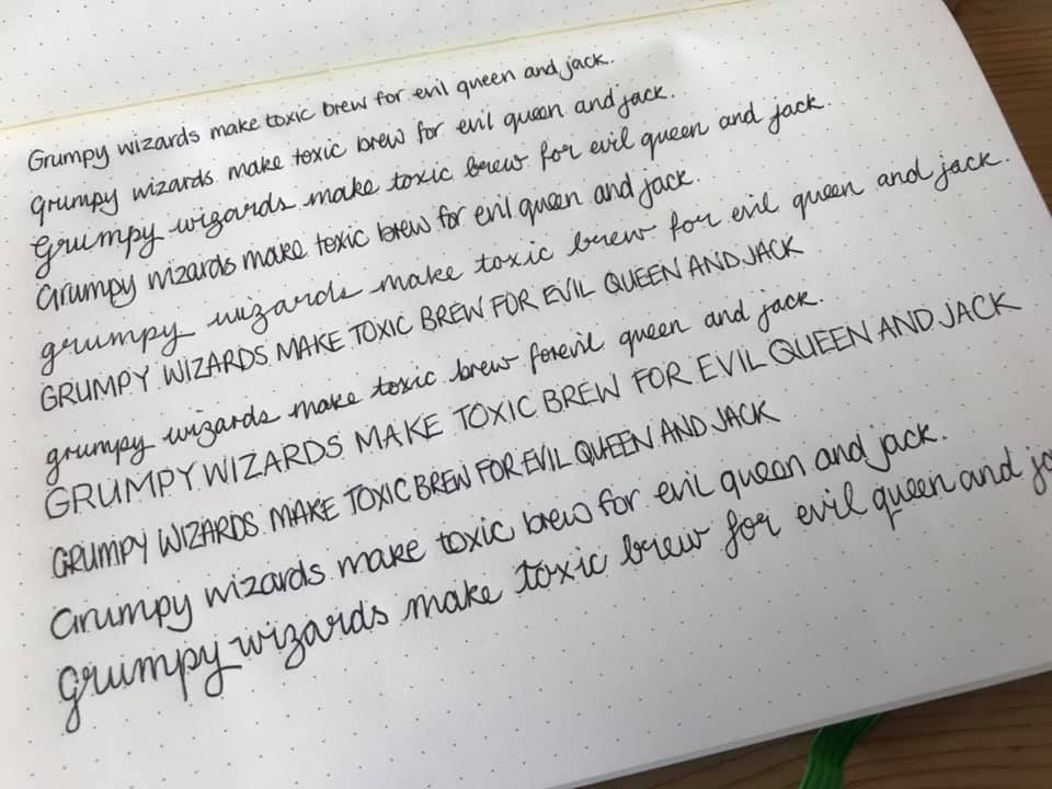
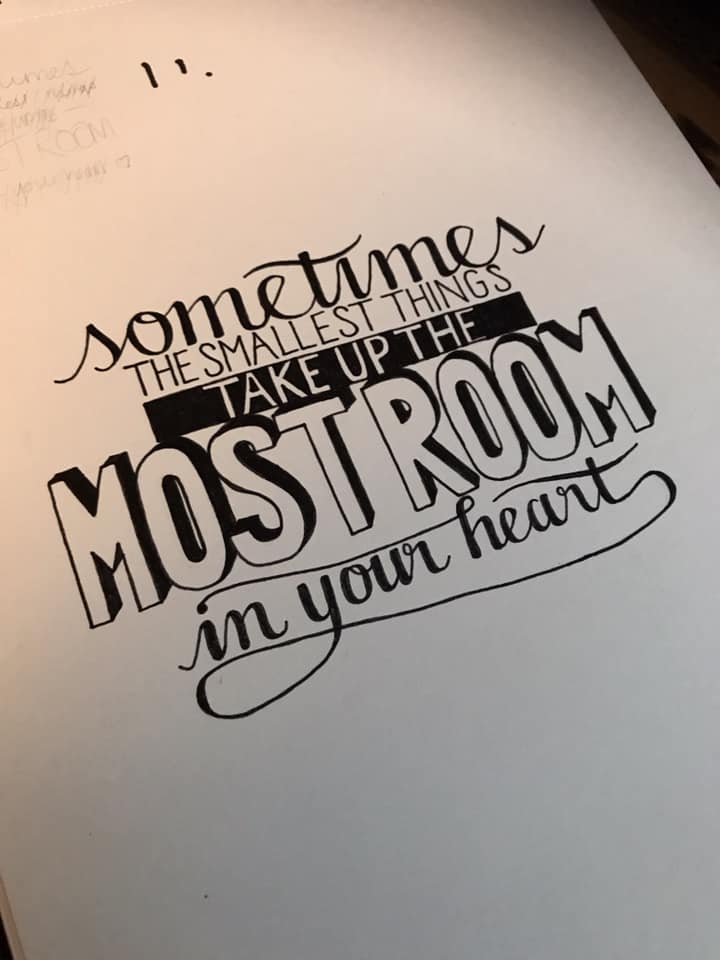
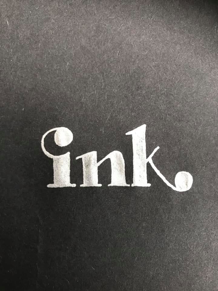
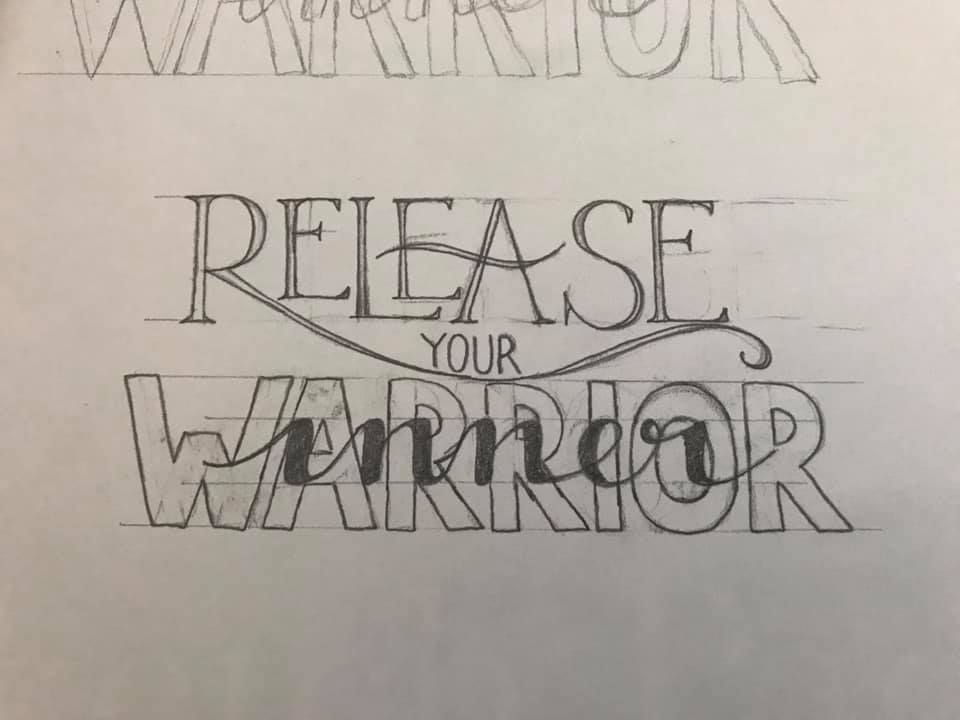
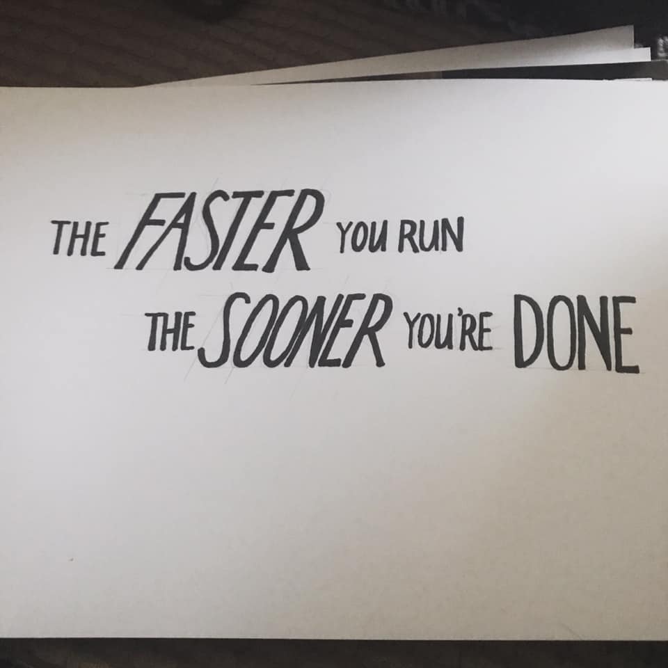
Day 32

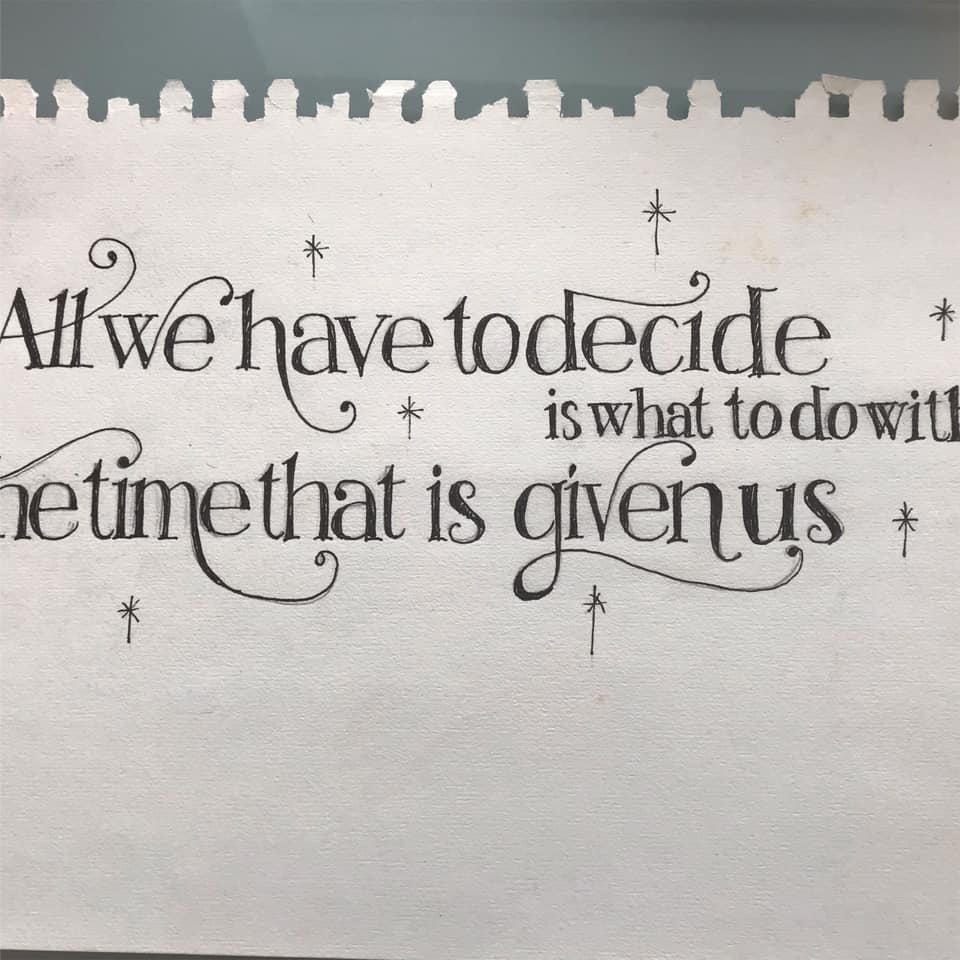
More grid paper, more finaliser, having a practice with both. I feel my sans serif capitals are not a strong point, so a little practice on this…
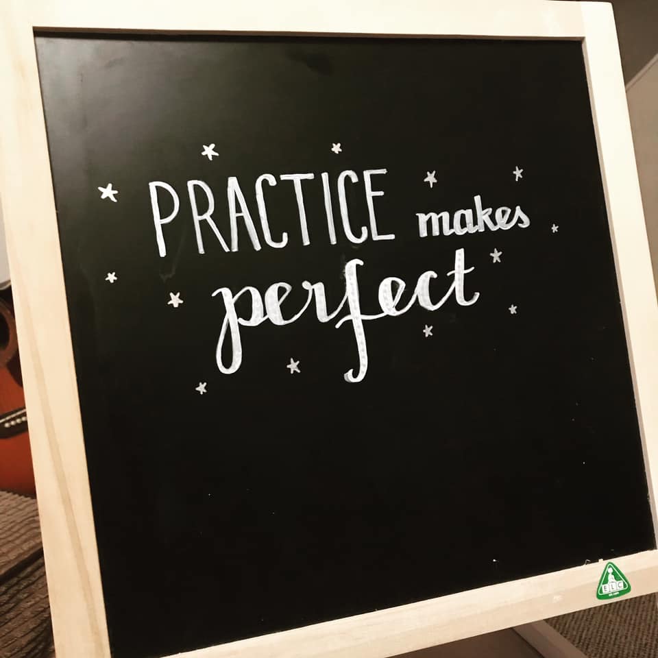
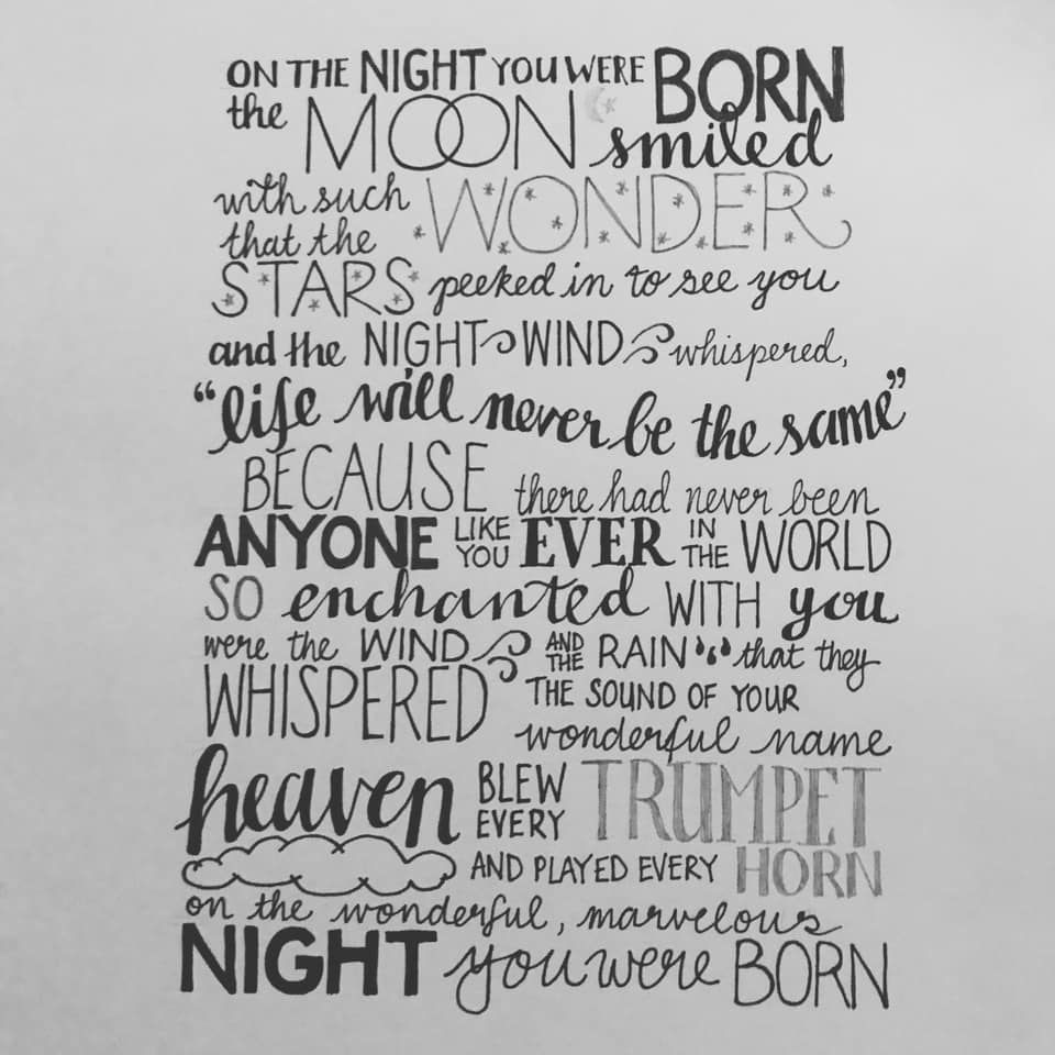
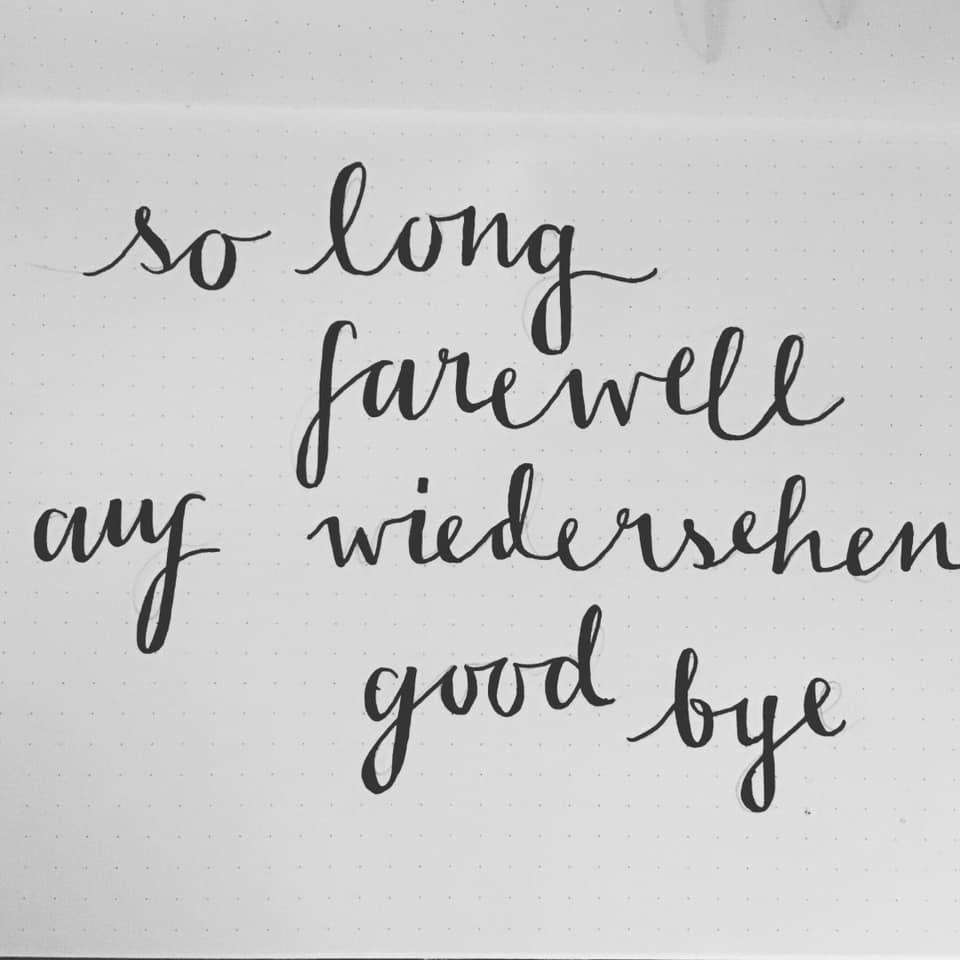
Day 33

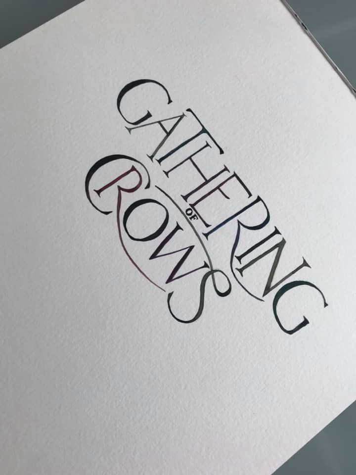
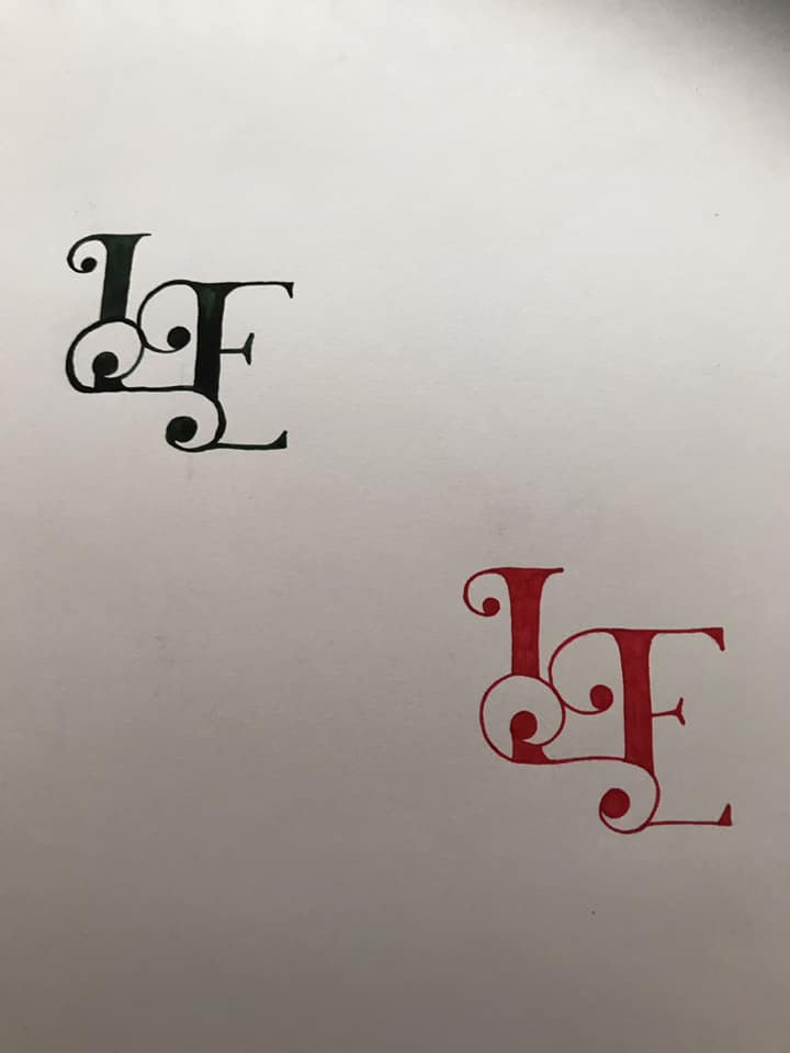
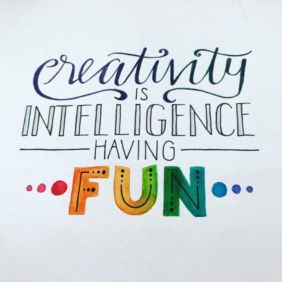
I missed a day, we have had some stuff going on, and I needed a day off. But back to it, practice with brush pens (not easy…) and some calligraphy. They seemed to work best on tracing paper… they glide well, so this is Arteza Watercolour brush pens on tracing paper!
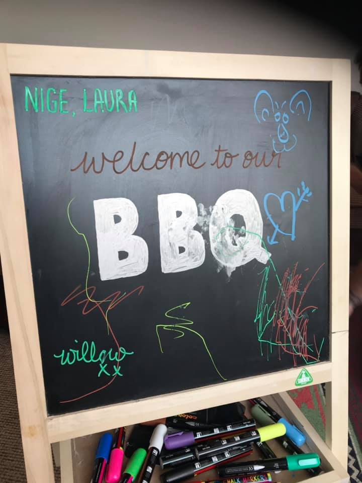
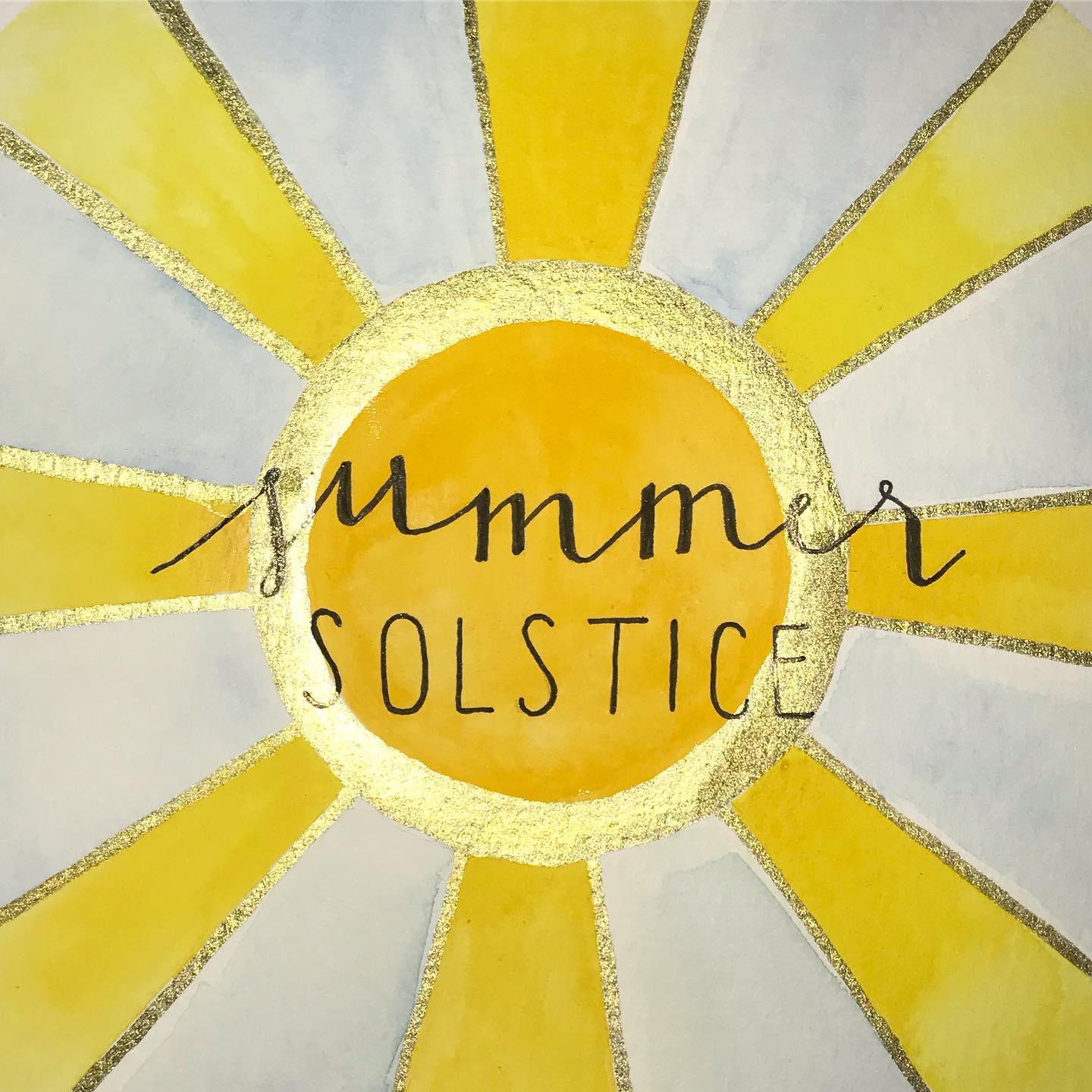
Day 34

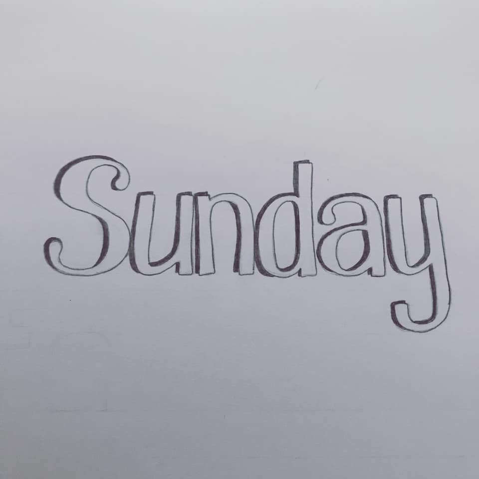
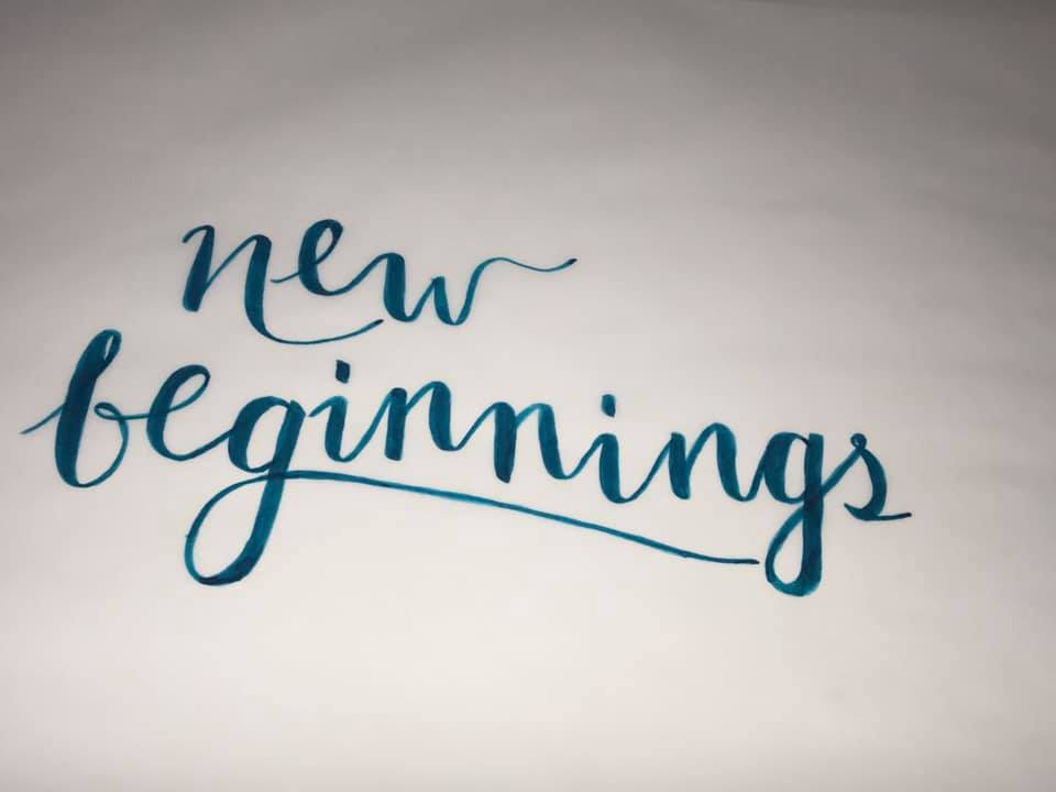
A little message to my sister and brother from another mother today. They are off back to Australia after a brief visit so I hastily scribbled a message – and a bit more practice with those brush pens! Arteza Watercolour brush pens on grid paper.

Day 35

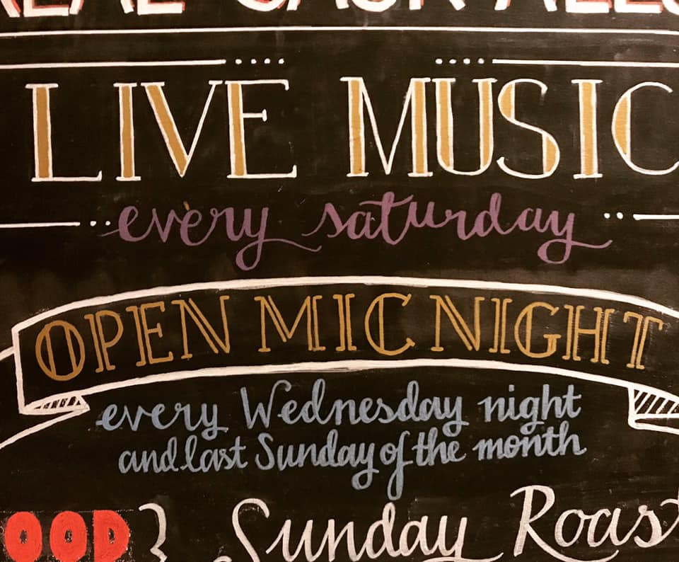
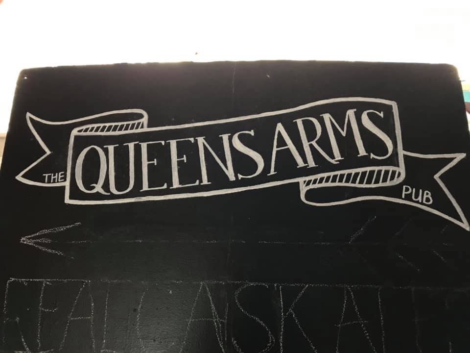
The Queens advertising board is almost complete…! There are bits I am not happy with in my perfectionist brain, but it is nearly done. Lots of styles, and colours to hopefully work together and draw the eye! Chalk pens on blackboard.

Next week is looking less busy, and with a bit more time to work on these… we’ll see!

100 Days of Lettering – Week 4

A round up of last week’s lettering…

Day 22

A rough sketch in preparation of the Queen’s Arms blackboard I’ll be doing over the next week or two. This will probably change as I draw it, but it’s a rough idea of the layout. Pencil on paper.

Day 23

Another rough sketch, this time on the board itself in chalk. I enjoyed doing this, great fun! Again, I think this will change as I draw it, but it was good to make a start and make sure there’s enough room for all the text. It was also good to see a more large scale project! Chalk on blackboard.

Day 24

I made a start on the board in chalk pens. This was hard work as it was difficult to draw at the right angle, but I am pleased with the results so far. Very eye-catching, I can’t wait to get this piece finished! Chalk pen on blackboard.

Day 25

A bit more progress today on the blackboard, using different colours as well, and as you can see it’s already changed from the original design, and the rough layout in chalk! It’s taking a while as this is not kind on my wrists, but it’s getting there! Chalk pens on blackboard.

Day 26

We went away for a few days camping in a field with no WIFI and no phone reception. I didn’t have a lot of time or a lot of resources, so this was very quick sketch based on how lovely it was there. The flowers aren’t great and the letters were done completely freehand (no rulers!) More of a doodle really! Pencil on paper.

Day 27

I’ve seen a few of these on Pinterest – I thought I’d give it a go whilst away, as I didn’t have a lot of materials with me. This is just a sampler of my handwriting and various styles, done on my lap in my notebook. Biro on grid paper.

Day 28

Inspired by the grid paper, I thought I’d have another go at this style. I think I’ve finally got it working – the word LOVE works well with the space in the middle. Pencil on grid paper.

Next week will hopefully see more work on blackboards (actual real life projects again) and more practice, practice, practice!

100 Days of Lettering – Week 3

We’ve had a lot going on this week, so this is a little late…

Day 15

Another attempt at this style of lettering – still not sure if it works, the A, G and H aren’t quite right. I’ll get there… black finaliser and Arteza Watercolour Brush Pens on Sketchbook.

Day 16

Another re-draw of this – I am really liking this and enjoying drawing it as well.I’m pleased with the layout, but painting it out with watercolours was a little difficult, and I may re-paint it to get it just right. Watercolour paints on watercolour paper.

Day 17

Over the years I have drawn many monograms of my initials, school and Uni projects, playing around and doodling and when starting my business. This is the best one I’ve ever drawn to date. Really pleased with the layout and design. I ended up doing it again in fineliner as the watercolour version was a little messy. Watercolour paint and fineliner on sketchpad.

Day 18

I had a little play with brand new chalk pens and my daughter’s chalkboard – definitely need some more practice with my sans serif capitals… but nice to play with chalk pens properly again! Chalkboard pens on blackboard.

Day 19

The culmination of a very busy week, with very little time… trying to spend some quality time with the family on this day, so we decided to do one together! Also a good excuse to try out all the chalk pens! Chalk pens on blackboard.

Day 20

I’m trying to practice uppercase letters, sans serif styles and some styles I’ve not tried much before (hence the 3D lettering). I was quite pleased with this! Pencil on sketchpad.

Day 21

Managed to tweak and then ink in this design – I had a go at negative white on black, although I’m not overly pleased with that bit! I have identified some bits I need to work on though, and I was quite pleased with the overall look. Fineliner pen on sketchbook.

I think next week will be concentrating on some actual work projects as well as some more practice on things I’m not comfortable with…!

Carers Week

Devon Carers asked me to design the Carers Week publicity to tie in with the new Devon Carers branding. I used the new colours and some of the newer imagery. I kept the same typography styles as the new magazine and kept it as simple as possible so the Carers can see the information they need quickly. See more on my portfolio.

100 Days of Lettering – Week 2

A mixed week, busy as always, so a few projects didn’t get finished, but I did play with different media a bit more which I was pleased about!

Day 8

I saw something similar to this and wanted to give it a go. This was a quick pencil sketch, finished with the Arteza watercolour brush pens. They bled slightly on the paper (another lesson learned…!) and I would have liked to have re-drawn it first to tweak the spacing but overall I like it!

Day 9

I am really pleased with this. It’s a piece for a bigger project for my Dad’s 60th birthday, and I started in the hope that I could re-trace, and possible even ink onto some nice paper and start experimenting with colours. However, my day ran away from me and this is as far as I got. But it’ll be back in one form or another, soon! Pencil on sketch pad.

Day 10

I had a break from the pencil. I have some old calligraphy nibs and some ink so I thought I’d have a play around. The paper wasn’t great for ink and sharp nibs, but it was nice to have a play around with it. I am planning on doing some more calligraphy over the next month or so (but with newer nibs!) so watch this space.

Day 11

An evening to myself… and a quiet baby. This was sketched very quickly in pencil, then re-drawn in fine-liners, originally in different colours, but I liked it in black and white when I photographed it. I’d really like to re-visit this with more time and make it tidier as I thoroughly enjoyed doing this. Fine-liners and sketch pad.

Day 12

An idea in my head that took a lot longer to get down on paper than I anticipated. It was very late at night when I finished (good thing it was the longest day really!) and I was tired, but I really like the idea. The execution could do with tweaking and a bit more time spent on it. Watercolour paint, gold ink, black fineliner.

Day 13

Another attempt at Willow’s name today – I like the “Willow” but the “Rose” seems wrong – not balanced or quite right yet. I’m hoping the next time you see it, it’ll be a finished version! Pencil sketch in sketch pad.

Day 14

Another go at this one too today. You can probably just see another attempt above as well! I have a few ideas for this one, which I’ve just wanted to get down on paper… again, I’m hoping to get this one finalised soon! There may be an illustration with this, so it might all change again! Pencil sketch on paper.

I’ve managed to spend a little more time on each of these this week. And play with some different media a little more. I am hoping to carry this on next week, and get some more ‘final’ pieces done. I also have a few jobs coming up that may be appearing on here too, watch this space.

100 Days of Lettering – Week 1

Just over a week ago I started this project. Finding an hour or so everyday to do this project is already proving a little tricky, although I have discovered that some days I have more time to get some ideas down on paper, which helps on the days when I’m struggling…

So this week, lets have a look at what I’ve managed to do:

Day 1Pencil sketch (I have a lovely mechanical pencil, 0.5mm, Faber Castel) on cartridge paper, with clack marker over the top. I took my time with this one, drew the design out, edited, traced and re-drew in pencil, before going over with marker. The marker was a little thick and I struggled a bit using it, but overall I am quite happy with the design. The word ‘lettering’ isn’t quite as balanced as I would like, so I may go back and revisit this one. But overall, I enjoyed doing this and I think for one of my first designs in a while it looks pretty good.

Day 2

I loved doing this one, again another sketch, trace, re-draw, but this time I used a different thinner fineliner. This fineliner is easier to draw with, although it is still not as tidy as I would like. This looks slightly unbalanced to me, the ‘Rose’ part in particular, and I think again, I’ll go back to this and keep editing until I’m happier.

Day 3

I had a migraine last week, and this was due on the first day of it. I had drawn this out as a sketch a few days before when I first decided to do this project, and instead of tracing and editing, I just inked over it with a fineliner, and my Arteza Watercolour pens. I wanted to have a go with them as I hadn’t used them for lettering, so this isn’t as tidy as I would have hoped. I also wanted to do something different with the word ‘fun’ but I didn’t have a lot of time so this is a little rushed. But a good experiment with different pens.

Day 4

My headache was still pretty bad, and I had a busy day again, so I re-drew an old design, editing slightly. I have a few versions of this in pencil now, so I’m looking forward to going back to this and finalising the design. I thoroughly enjoyed this, despite my head, and I am pleased with the direction it’s going in. I need to work on the flourishes, and the spacing, and have a think about the finish, but it’s coming along nicely!

Day 5

A pencil sketch with a normal B pencil, on sketchpad paper, with black fineliner over the top. Again, an old sketch that I have inked, I think this needs some more editing but I like the idea. I have some ideas for the final execution of this – away from white paper and black ink, so hopefully I’ll get to this soon.

Day 6

A really quick one for Saturday, confusingly I wrote Sunday… this was a few sketches for the weekend as we were out and about and I wasn’t sure if I had a lot of time. As it turned out I didn’t have much time, and this was a basic sketch, playing around with shadows. Not overly happily, but managed to get something down on paper!

Day 7

I should have left this in pencil…! The pen I used is a brush pen from a set I bought ages ago. It bled on the page, and the tip was thick and not easy to use. The paper was not great either, so all in all not a great combination. However, I learnt a lot doing this, so I wanted to use it for that day’s drawing. I found the slanted text harder to draw than I thought it would be. And I won’t be using that pen again…

I feel I have identified some weaknesses this week, and the sort of designs that I enjoy and are better at… I have picked up some supplies and tutorials for Calligraphy so I’m hoping to incorporate a bit more of this next week… we’ll see! I have a few pieces coming up as well, so there will be some personal art pieces, and some work hopefully coming up soon!

100 days of lettering

I’ve been trying to get some pieces ready for the Sunshine & Shenanigans store for some time now. I have hundreds of ideas, but not a lot of time, my daughter is now a year old and between her and my freelance work I’ve been busy busy busy! I have felt like I’ve needed to get my act together, and needed a push in the right direction…

I have started feeling very inspired though, and really want to branch out into some different creative fields. I’ve been drawing, sketching and painting more in the evenings when I have a spare half hour and have been feeling drawn (excuse the pun) back to lettering – something that has always been a passion, right from when I was a young child. I used to spend hours with my mum’s calligraphy book, copy out and tracing letters, writing out stories and making cards. At university I chose a course which specialised in typography and spent a lot of time in the letterpress studio. I spend hours poring over calligraphy and blackboards, wedding invitations and posters on Pinterest. So I’ve decided to do a few refresher courses, and branch out into more work in this area.

To compliment this, to help me get my ideas down on paper, and for practice, I have set myself a challenge… 100 days of lettering. Everyday for 100 days I am hoping to post a picture of a piece of hand-drawn lettering. It might be calligraphy, it might be hand drawn letters in pencil, it might be a chalkboard, a poster, a letter… it might be a personal piece of work, a gift, something for a client, something I’m trying to practice or master, a word, a quote, a phrase, a whole page. It might be just a sketch, or a finished piece. It might be illustrated, it might be just text. It might be ink, pencil, paint, chalk, crayons… you get the idea!

The only rules I have set myself:

  1. It has to be hand drawn – the finished final piece may well become digital but the piece must start as hand- drawn and what I post must be hand drawn.
  2. I have to post something everyday.
  3. It has to be at least one letter.

So there you have it. I have committed it to the internet, so I’ll look a bit daft if I don’t do it now. Hopefully this will help me improve, and be a bit of fun! I’ll post everyday on Facebook, Instagram and Twitter, and once a week I’ll put the week’s pictures in a blog post, along with my comments and thoughts on it all.

So to start us off today I have hand drawn the title of this challenge… original drawing in pencil, final drawing in fine liner and black marker.

Devon Carers Hospital Discharge Literature

As part of the updates to the Devon Carers branding, I updated the Hospital Discharge literature recently. We used the new colours in conjunction with the old colours and typography, new imagery and updated content.

There are DL leaflets, flyers, information cards, posters and a pop up banner, all updated and edited to reflect the new branding and changes. This is an ongoing project, with more work coming soon, as new pieces need to be updated and re-printed, but this was one of the bigger jobs.

You can see this updated project, and other Devon Carers work on my portfolio.

Ron Campion Winter Sale

Last winter I worked on the Winter Sale brochures and materials for Ron Campion Furnishers. There was brochure based on previous editions, adverts and banners, all branded with the Ron Campion colours and typography but with a winter sale twist.

We stuck to the cyan for the primary colour, added some snowflakes and used the typography and styling from previous brochures and adverts. The brochure had a lot of information, but we concentrated on the imagery where we could and designed something easy to flick through, highlighting the furniture and products in general as much as possible.